
The human visual system has evolved from the primitive foundation of separating stationary and moving objects to complex processes such using memories. It expanded it’s capabilities to meet our increased level of interaction with the environment. (Horridge, 1986) Our ability to identify signals and send the information to the brain allows us to find minute details and create complex relationships with other humans, technology, and tools. (Allison, Puce, McCarthy, 2000) Designers of all ilk research and use the human biological systems of perception to create products that satisfy human needs. (McDonagh, Bruseberg, Haslam, 2002) The eye, along with other senses, allows for people to use parallel processing, signal detection, and contrast to examine the environment and make interaction with devices possible.
Disclaimer: The first part of this is a review of human’s pre-attentive processing system. It’s a bit dense. If you’re not into that sort of thing skim it or skip down to read about the poor information architecture of critical systems in the Indianapolis airport.
An analysis of vision starts with the anatomy of the eye. The human eye consists of the cornea, the lens, the humors, the iris, the retina, the fovea, the macula, and the optic nerve. Several important features of the retina help in the study of human factors. The retina contains six main classes of cell and two types of photoreceptors, called rods and cones. Both convert light into an electrical signal. Although there are far more rods than cones, rods spread their response over hundreds of receptors while single cones feed into ganglion cells. (Fairchild 2013) Rods are sensitive enough to capture photons when there is little light, though they can’t transmit color because they can’t discriminate between spectral modulations.
Cones respond at higher light levels. There are three types, long, medium, and short. Mark Fairchild (2013) expands, “It turns out that the short cones are relatively sparsely populated throughout the retina and completely absent in the most central area of the fovea. There are far more long and medium cones than short cones and there are approximately twice as many long cones as medium cones.” (p. 10) This explains the variety of cone responses at different wavelengths. Red cones respond at long wavelengths, green at medium wavelengths, and blue at short wavelengths. Long and medium cones combined to show red-green discrimination while all three types of cones respond to show a blue-yellow channel. Luminosity is shown by combining long and medium cones while possibly including small cones. (Wässle 2004)
The fovea is part of the retina and might be the most important structure in analyzing how people see objects. There are no rods but it subtends to an angle of about 2 degrees in the central field of vision. People move their heads so that the image is in line with the fovea. (Fairchild, 2013)
Fairchild also touched upon the existence and characteristics of the blind spot of the retina. He wrote (2013), “Since your brain no longer has any signal indicating a change in the visual stimulus at that location, it simply fills in the most probable stimulus.” (p. 12)
The construction of the eye allows vision, parallel processing, and signal detection. Eckstein (1998) noted, “The first stage in models of human visual processing is the independent parallel processing of different physical attributes such as color, orientation, motion, and form.” (p. 111) He adds, “The most prominent model, feature integration theory, suggests that a serial mechanism, visual attention, binds information across feature dimensions.” (p. 111)
Parallel processing makes signal detection possible. The goal of signal detection theory is to estimate the signal and the noise from the experimental data. The first parameter reflects the strength of the signal. Abdi (2007) writes, “In particular signal detection theory is used to analyze experiments where a binary answer (e.g., “Yes” vs “No”) needs to be provided.” (p. 1)
We wouldn’t be able to differentiate between all of the signals parallel processing allows for without contrast. Kaplan and Shapley (1985) note how important contrast is in the visual world when they write, “It is the physical quantity that specifies the relative variation in luminance of a visual stimulus compared to its average level. The visibility and brightness of objects depend mainly on the contrast with their background.” (p. 2755)
If there is a high contrast masker an object is harder to detect. (Teo and Heeger, 1994, p. 2) Watson and Solomon (1997) conducted experiments analyzing humans ability to pick up a variety of patterns. They add, “With some notable exceptions, spatial patterns are most easily seen against a uniform background; backgrounds that contain spatial patterns typically raise visual thresholds.” (Watson & Solomon, 1997, p. 2380)
Visual contrast aids us in acknowledging that there are five dimensions of color appearance: brightness, lightness, colorfulness, chroma, and hue. Brightness appears to emit more or less light. Fairchild (2013) says, “Lightness is the relative to the brightness of a similarly illuminated area.” (p. 86) He notes, “Colorfulness describes the intensity of the hue in a given color stimulus.” (p. 86) Chroma is proportionate to colorfulness the same way that lightness is relative to brightness. Hue is red, yellow, green, blue or a combination of them. (Fairchild 2013)
Fairchild (2013) distinguishes between chroma and saturation when he writes, “Saturation is the colorfulness of a stimulus relative to it’s own brightness.” (p. 88) While chroma is relative to a similar area that appears white, saturation can appear in isolation. As an object falls deeper into shadow, it becomes darker, but the saturation of the object remains constant.(Fairchild, 2013)
Camgöz, Nilgün, Cengiz Yener, and Dilek Güvenç (2003) conducted an experiment analyzing the visual hierarchy of hue, saturation, and brightness on foreground and background colors. They found that brightness and saturation grab attention more than hue. They wrote, “On every background color, the coloured squares having maximum saturation and maximum brightness were found to attract the most attention.” (p. 25)
Researchers Borji, Sihite, and Itti (2013) conducted an experiment examining people’s ability to measure the saliency of images on a computer display by having them pick the image that stands out the most. Then, they increased the size of the same image. They found, “The probability that the larger object in a scene to be selected is 0.1504 ± 0.1149, compared to 0.0851 ± 0.1149 for the smaller object being selected.” (p. 68) Raising the size of the texture of the background was statistically significant and made a dramatic improvement in the object being selected.
Wanat and Mantiuk (2014) conducted a test examining how color contrast can vary, as there is less light. They noted that as the room dimmed, resulting in a loss of color, the cones lost their sensitivity and the rods started to function. “The most dramatic change in vision is observed when luminance drops below 3–5 cd/m2.” (147) The found that images needed to be adjusted based on the level of luminance.
Liegh et al. (1988) conducted a separate experiment during nighttime, focusing on the concept of an after-image. They found, “When an after-image is flashed onto the fovea of a normal subject the perception is one of a stable after-image superimposed on the stable fixation target. If the subject moves his eyes, the perception is that of an after-image “moving with the eyes” over the stable surround.” (281)
Mundhenk and Itti (2005) note that contours are important in seeing objects. They noticed that the ends of contours and the junctions between contours are particularly important for people in their interpretation of objects. A study by Kovács (1996) adds, “It has been shown with psychophysical reverse mapping that visual detection is enhanced when a target is positioned within a closed contour (Kovács, 1996, 9).”
Watson and Ahumada examined motion detection in 1985. They found the eye perceiving motion was a major factor on how humans view depth, different objects, eye movements, visual prominence and the “the estimation of the motion of objects in the world.” (p. 322) They add, “Motion perception is a process that examines the physical stimulus and controls perceptions, judgments, and actions related to the motion of objects or their projections.”
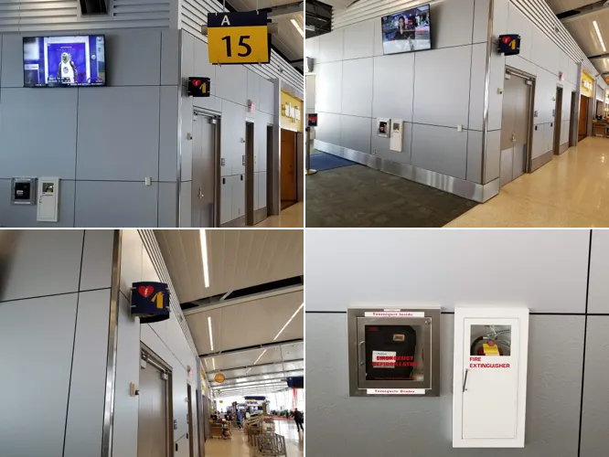
I was able to examine aspects of the information architecture as I was passing through the Indianapolis airport. There were several situations where the visual hierarchy was off but none concerned me more than the way they presented their emergency medical devices. The low level of visual hierarchy, importance of the fire extinguisher and the AED, and stress people feel when they need to find the devices makes it likely people don’t detect the signals when they’re needed most.
The signs, containers, and emergency devices don’t live in a vacuum. They exist in contrast with the objects around them. The picture in the upper-left shows all of the objects that are competing for visual attention in the space. It’s easy to see that the luminance, size, and motion of the television draw people’s visual focus. Kaplan and Shapley (1985), Borji, Sihite, and Itti (2013), Watson and Ahumada (1985) wrote about these subfactors and noted these three properties are major factors in the grabbing the attention of human’s biological receptors. It’s no surprise the TV dominates the visual prominence of the area. The size, hue, and sharp contours of the gate number make it stand out and help it place second in the competition for people’s attention. Borji, Sihite, and Itti (2013), Camgöz, Nilgün, Cengiz Yener, and Dilek Güvenç (2003), and Mundhenk and Itti (2005) noted that size and contours had a large role in making a signal visually prominent. The yellow hue plays a lesser role but is in a prominent part of the human visible light spectrum. (Fairchild 2013) The sign and containers of the emergency devices lack many of these sub-factors and are barely noticeable compared to the elements around them.
The two states of being, emergency situations and non-emergency situations, complicate the visual hierarchy of the information. If it’s a non-emergency situation the signs and containers for the extinguisher and AED should fade into the background. As soon as there is an emergency, they should drown out the noise and take some of the highest visual prominence in the entire airport. The immediate and accurate detection of the signal is critical.
It’s impossible to place visual prominence on the emergency systems with color alone. Solutions to vary the hierarchy of the information between the two states could include altering the brightness and saturation of the sign and containers when an emergency is taking place. (Camgöz, Nilgün, Cengiz Yener, and Dilek Güvenç, 2003) It may also be useful to introduce motion around the sign and around the containers to indicate where they’re located. (Watson and Ahumada, 1985)
The containers holding the emergency equipment have a low level of contrast with the space and objects around them. Fire extinguishers may have a red hue and have high saturation and luminance but the box covering it is white with very low luminance. The hue of the box holding the AED is a very similar grey to the area around it. It has a somewhat high level of luminance but it’s small and partly covered with labels. Exposing the red hue of the fire extinguisher and the yellow hue of the AED would help to make the objects more visibly prominent but increasing the luminance and saturation would be more effective. (Camgöz, Nilgün, Cengiz Yener, and Dilek Güvenç, 2003)
The high likelihood of fire when the extinguisher and AED are needed presents the risk of emergencies resulting in near-complete darkness. Human’s inability to see low-luminance signs in the dark makes it essentials to make the signs and containers for the extinguisher and AED highly luminous.
In an emergency, the location of the fire extinguisher and AED is important information to everyone in the vicinity. This affects people of all ages and abilities. The contrast of the signs and the devices should be altered to comply with ADA standards so that every person’s biological receptors can identify where the emergency systems are located.
Other biological sensory systems share many of the same principles. The sub-factors outlined above, including but not limited to, luminance, saturation, size, and motion affect the visual hierarchy of the objects outlined in the case study. Modifications to these sub-factors increase the level of contrast of the extinguisher and AED during a state of emergency while limiting them during non-critical situations. This allows people’s biological receptors to identify and transmit the correct objects at the appropriate time.
That’s it. Thanks for reading! If you enjoyed reading this and want to read more, check out other articles I’ve written.