One of my final courses in Bentley’s HFID program was titled information architecture, although the professor used the course to a way to generate portfolio pieces that we could display to prospective employers. I linked up with two students Adi and Katherine to create Nuptium, a concept site for selling wedding related accessories. I suggested the idea, since I had already designed and launched the wedding card boxes and I had ideas of other wedding related items to launch.
During the process we conducted user research in the form of user interviews and administering a card sorting activity. We created UX artifacts such as personas, journey maps, wireframes, and prototypes. Our final class consisted of a presentation of our findings and a demonstration of the prototype.
Prior to conducting research, we discussed what our fictional company would be called and formed a mission statement:
Nuptium is an e-commerce startup focused on providing people with beautiful accessories for their wedding related events. Nuptium is committed to providing unparalleled support through our mobile experience, creative inspiration, innovative solutions, and personalized experiences that transform dreams into reality.
This helped us level-set on what we were researching and who we were designing for as a company.
Our research consisted of three parts, a competitive analysis, user interviews, and a card sorting activity. Since we were creating the website for an Information Architecture course, our primary objective was determining how themes, individual preferences, and individual desires influence how we should structure information on the site. Our secondary objectives were informing business needs on customer behavior and competitors.
Surprisingly, outside of small businesses that sell on large aggregators sites like Amazon we found very few websites dedicated to selling wedding accessories. There were two competitors, Myweddingfavors.com and Beau-coup.com, and one comparator Heatherwillow.com we identified and examined as part of our competitive analysis.
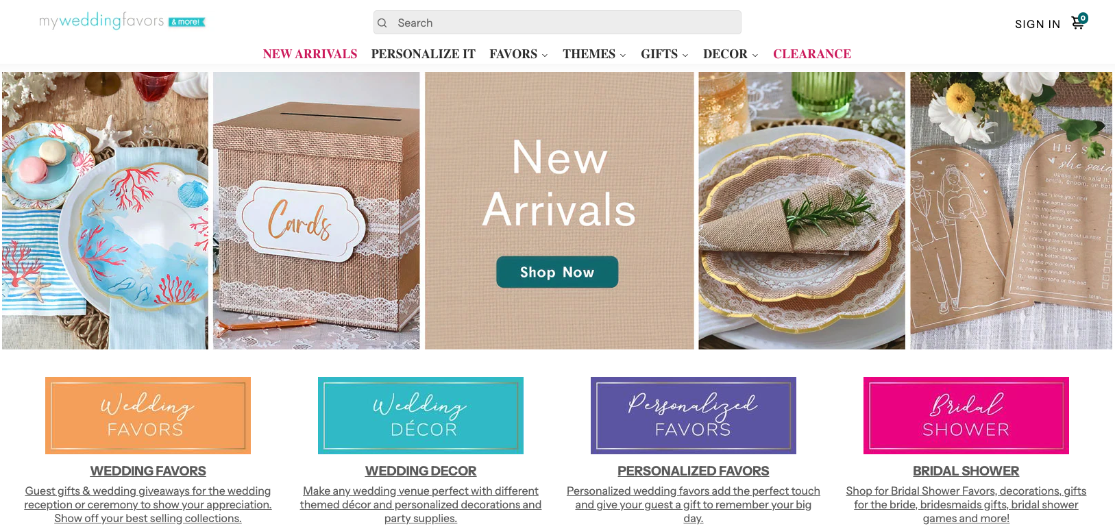
Although each website sells wedding accessories they have very different structures, categorizations, sorting and filters. My Wedding Favors structured their main navigation with a mix of wedding related categories. The cards across the bottom of the screen act as a type of sub-menu with additional wedding related categories to sort the shop by. Within their shop people could sort and filter in a variety of ways.
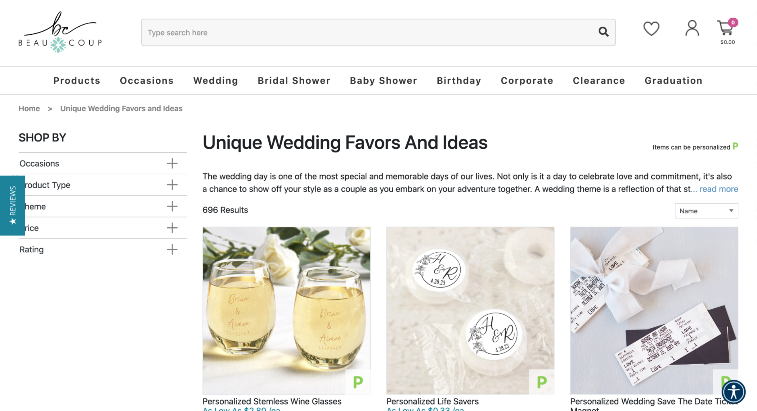
Beau-Coup sells accessories for many types of celebrations, not just weddings. The information architecture of their main navigation menu reflects this broad scope. Their homepage features tiles of a number of different categories and subcategories people can filter and sort with on their website. The sort and filtering options expand when navigating to the shop.
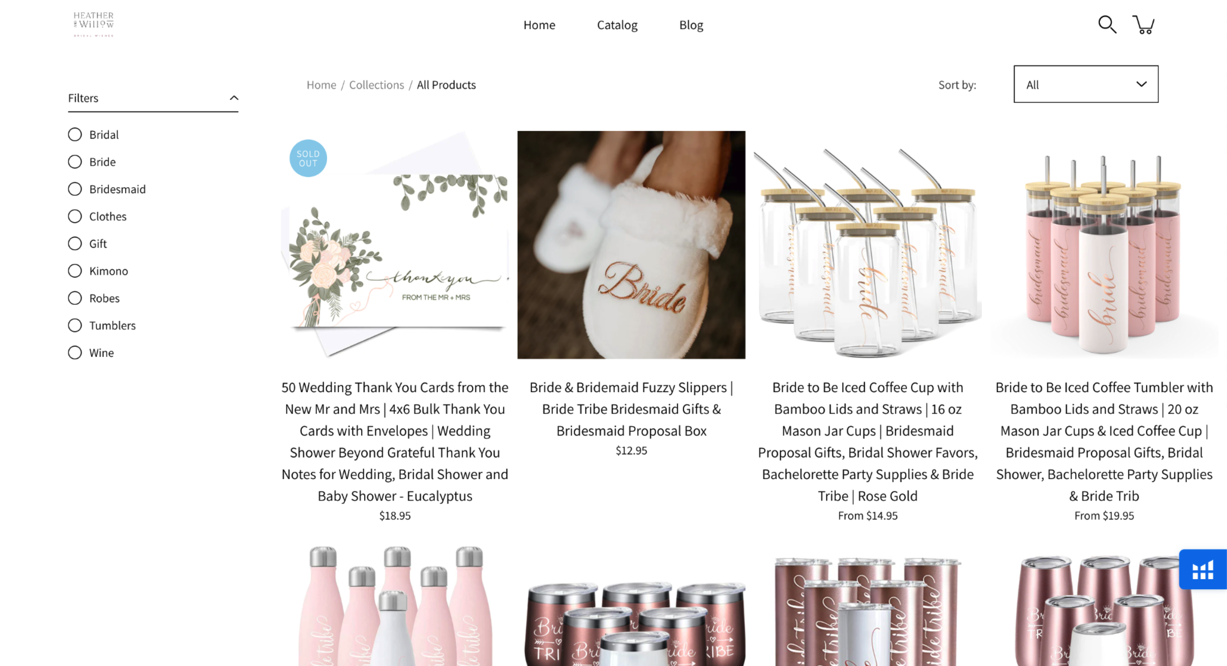
Since Heather & Willow is a small ecommerce shop with only 26 items, their top navigation consists of a link to home, their catalog, and their blog. The filters on their catalog are specific to their focus on bridesmaids items. Their sort options are in line with the other two websites though.
The extremes, consistency and inconsistency were the most interesting part of our competitive analysis. Regarding the menu structure, the greater the amount, and the larger the diversity of products in the shop’s portfolio, the greater the need is for definition of menus and submenus. There was a fair degree of consistency between the filters on the larger websites, with the smaller website focusing on filtering their major category. There was the most consistency in the sortable items in all three sites with bestselling, price, and name all appearing on the list.
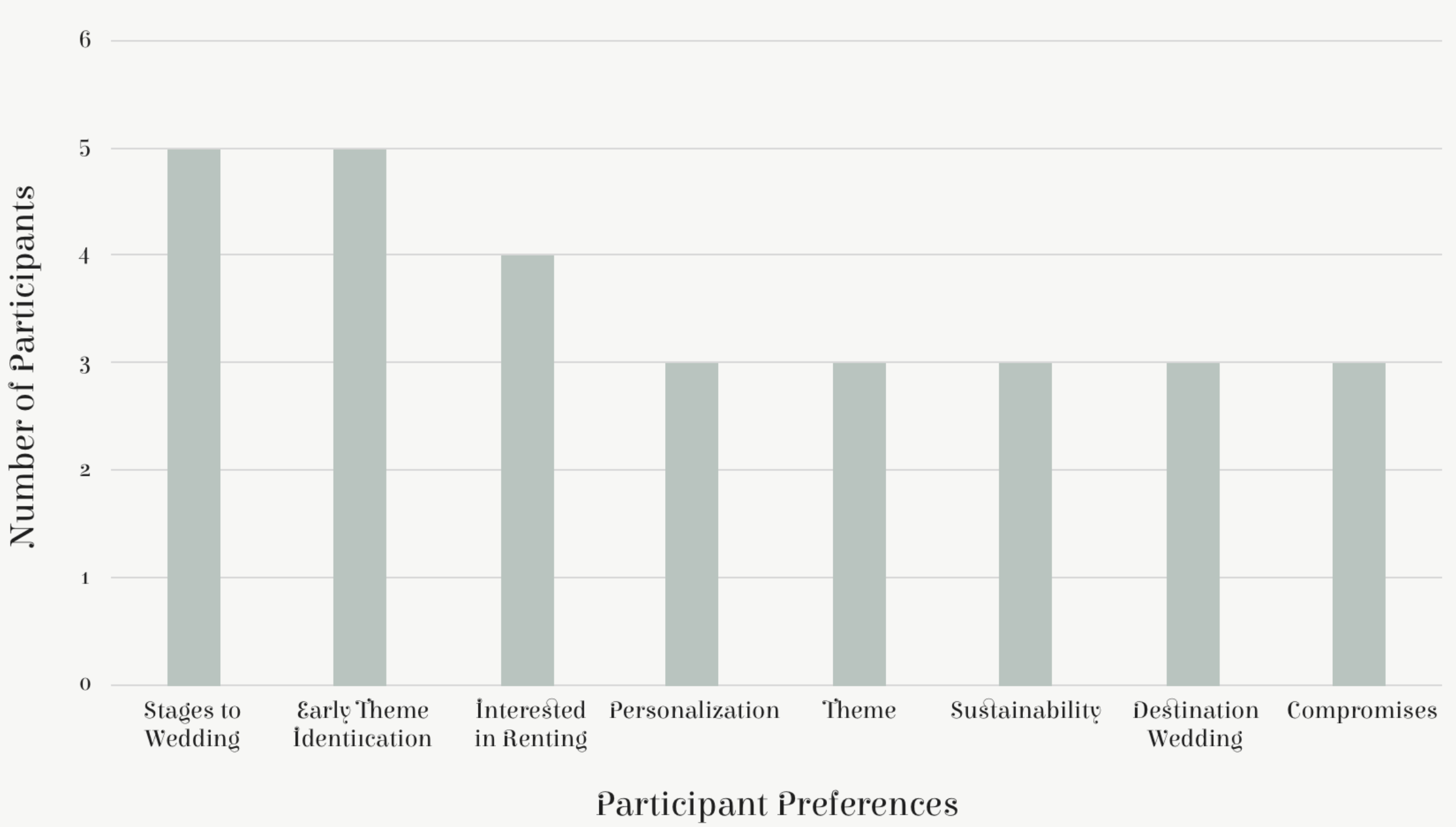
We looked for consistency and variance from our user interviews compared with our hypotheses. Most people had the same stages to the wedding, in wedding, ceremony and reception. They identified themes to their wedding early in the process too, although these themes were more likely to be based on the location or the venue than any ‘Theme.’ The majority of our participants were interested in renting wedding materials they didn’t personalize, although many of these people had to make compromises because of the venue or due to their wedding being a destination wedding. There was also a passing interest in sustainability.
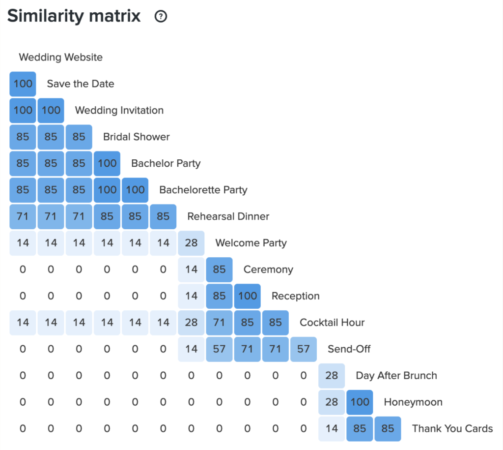
There was a high degree of consistency with how participants categorized items into the closed sort, pre-wedding, wedding, and post wedding categories. The minor variances were with less popular wedding activities including the welcome party, the day after brunch, and to a lesser degree, the send off.
From a purely IA perspective, the top learnings were that the more items that were in the shop, the more top level categorization is needed. Based on our research, there was clear top and subcategorization of wedding related events. Every sized shop has filter capability within this industry and the sort options are mostly uniform regardless of the size of the shop.
Business needs and opportunities may affect the IA here. The majority of participants wanted to rent at least some items for their wedding. People also identified the vibe of their wedding early, which ties into the multitude of sort and filter options in that they know what they’re looking for. Also, a number of participants had a destination wedding or a wedding somewhat far away, which affected people’s ability to purchase accessories and bring them to their wedding. This may manifest in a ship directly to the venue option.
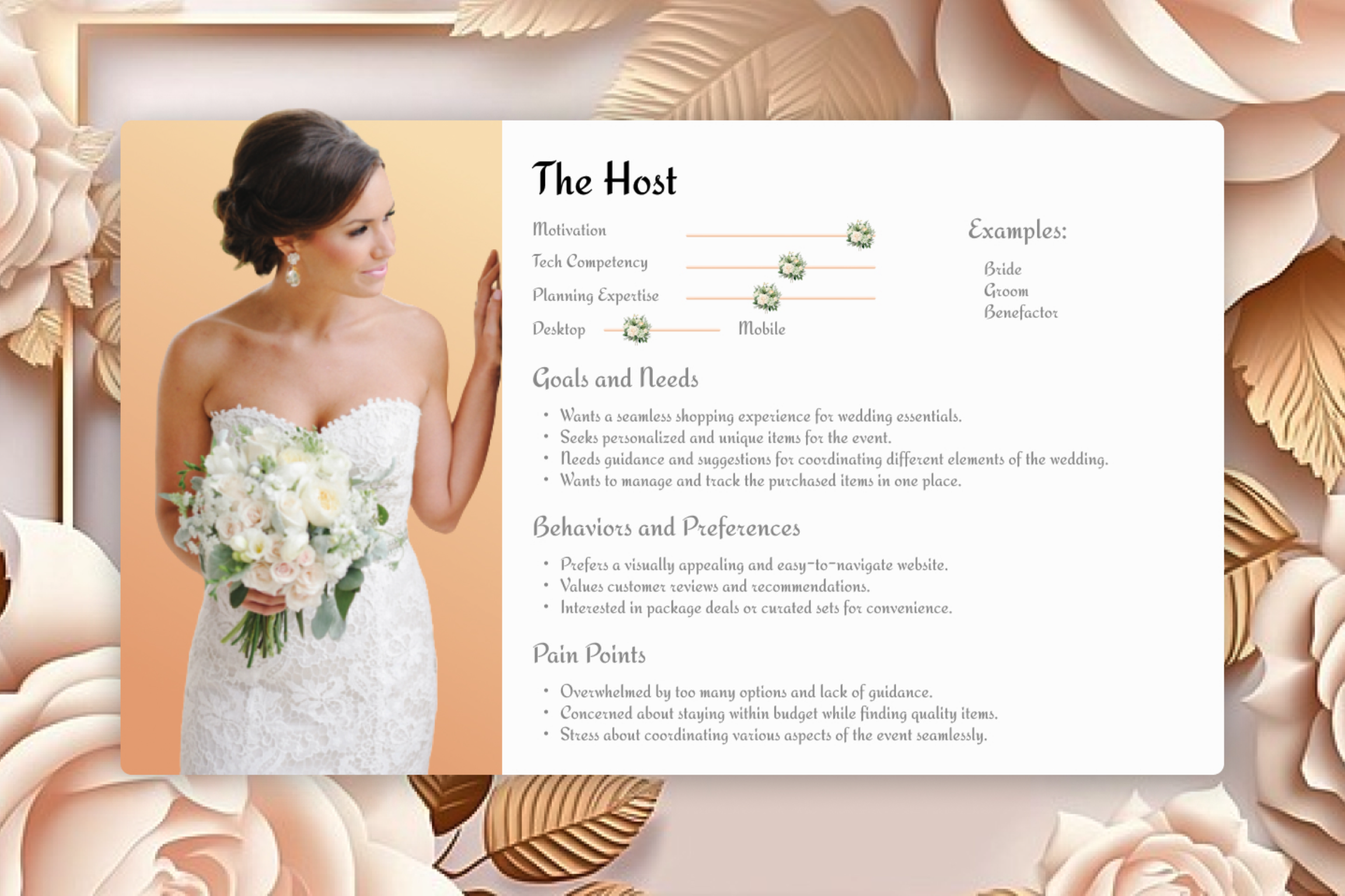
The host was our primary persona, with brides being the vast majority of hosts. They want a seamless shopping experience where they’re able to stay within their budget.
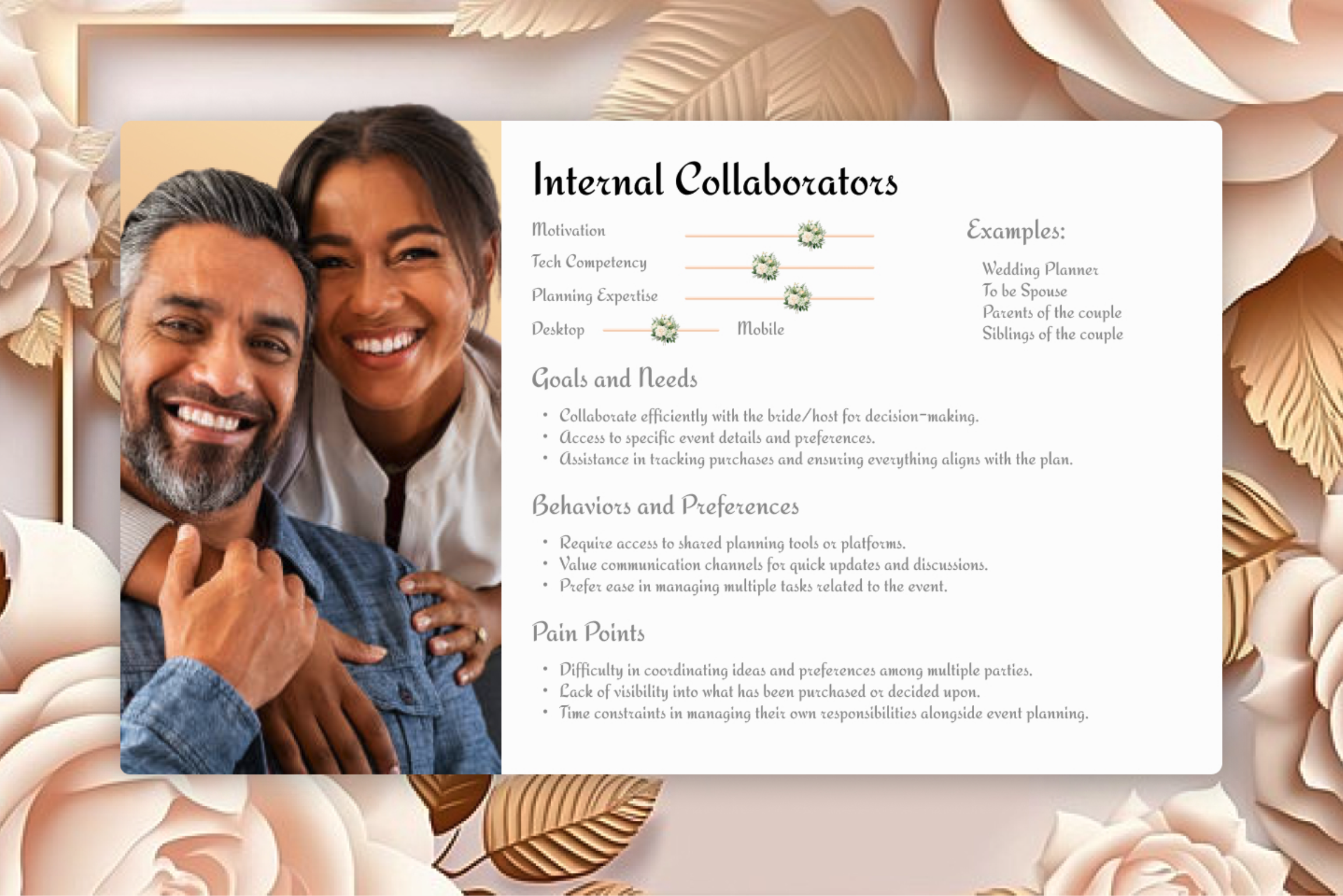
Internal collaborators were one of the secondary personas, with wedding planners and the hosts spouse as top examples. Their goals are to collaborate with the host in decision making while not impeding the host’s decision making power.
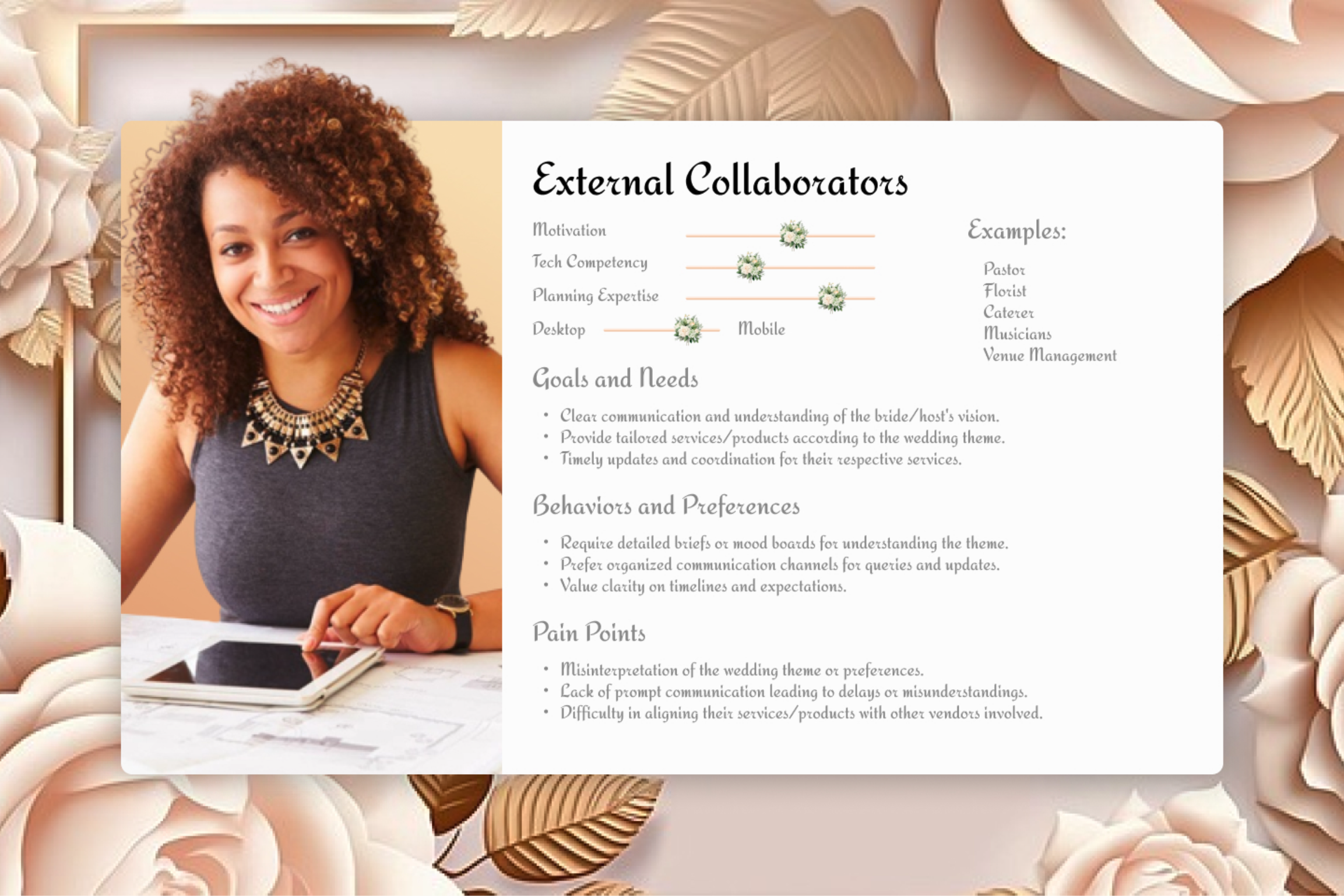
External collaborators are wedding vendors such as venue management and caterers. They have specific restrictions they may put on the host in accordance with their business policies that the host may have to adapt too.
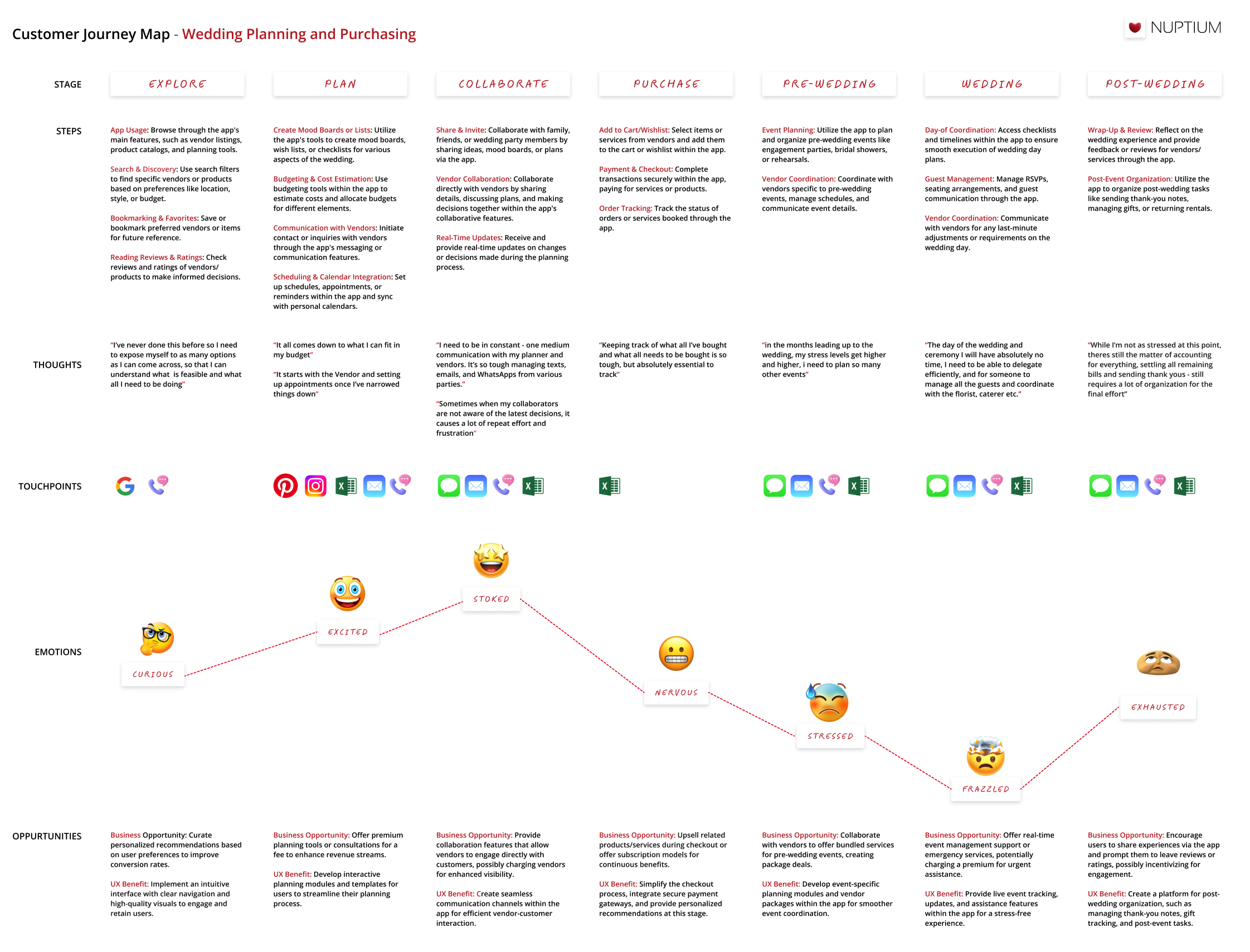
We built the journey map to develop empathy for our primary persona, the bride, within the confines of the wedding planning and purchasing process. We defined the stages and steps of the journey map with input from the card sorting activity and used the interviews we conducted to inform people’s thoughts, touch-points, and emotions. The combination of the data informed both the business opportunities and the UX benefit. It’s tough to see on the sheet. The opportunities we came up with were:
We came up with the following questions to user’s journey and assist with the design process:
Business context: What are the objectives of the business?
Strategic imperatives: What needs to happen for the MVP to be successful?
Context of use: Where and how do we envision users to utilize this?
User behavior: What will drive users to undertake actions on the app?
This helped us create a sitemap:
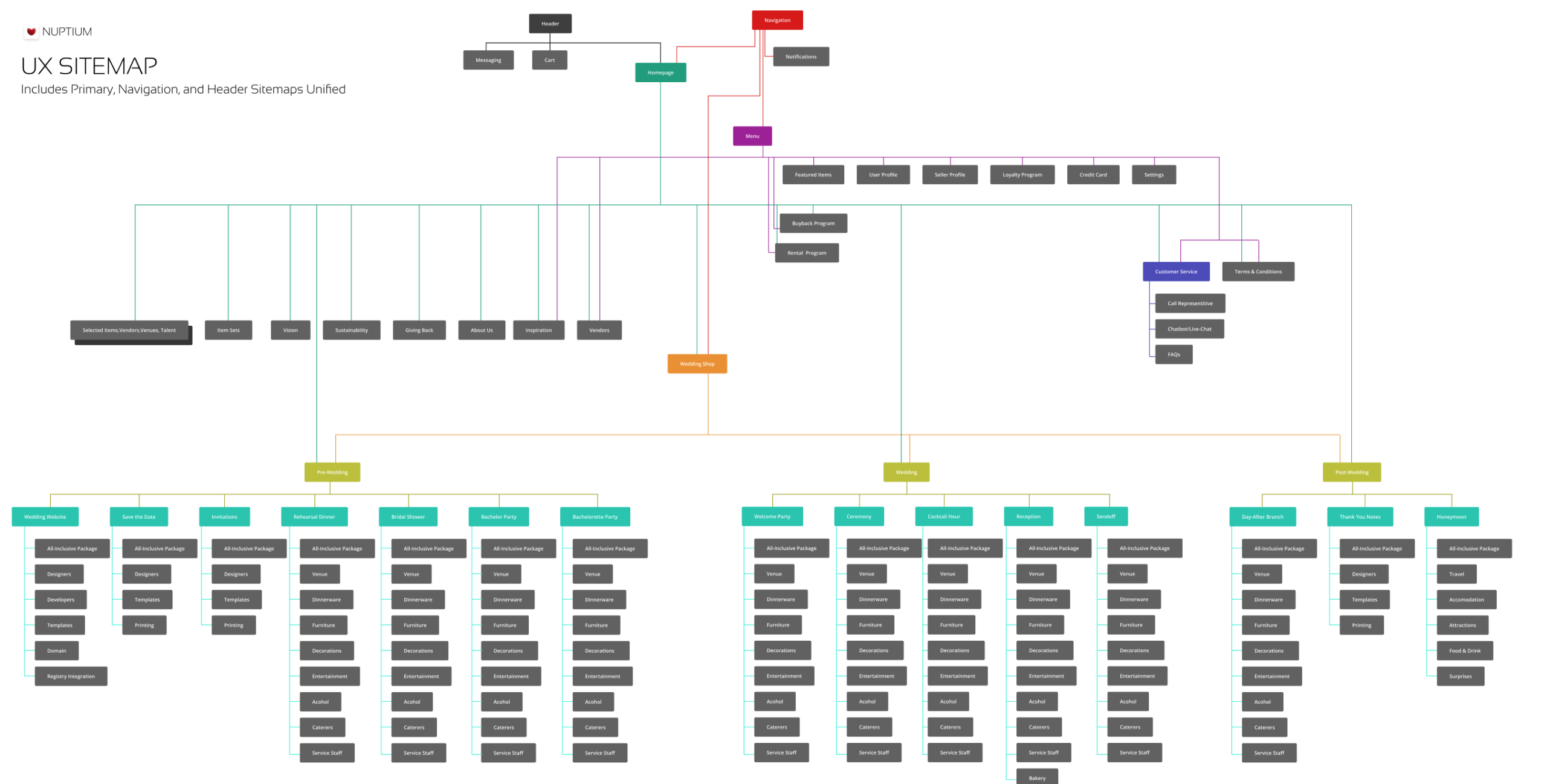
Our sitemap draws heavily from the card-sorting activity, particularly in defining the categories of pre-wedding, wedding, and post-wedding. We also followed their advice for the sub-categorizations as people sorted them within the card-sorting activity. Separate from the navigation structure was a messaging section, shopping cart, notifications, featured items, user profile, seller profile, loyalty program, credit card, settings, customer service, and terms & conditions.
I don’t have a slide deck for any of the other items in my portfolio and I’m pretty proud of how our presentation went so I’m including our deck below. Adi, Katherine and I all had a hand in the slides but I spoke to the research portion of the deck during the presentation.
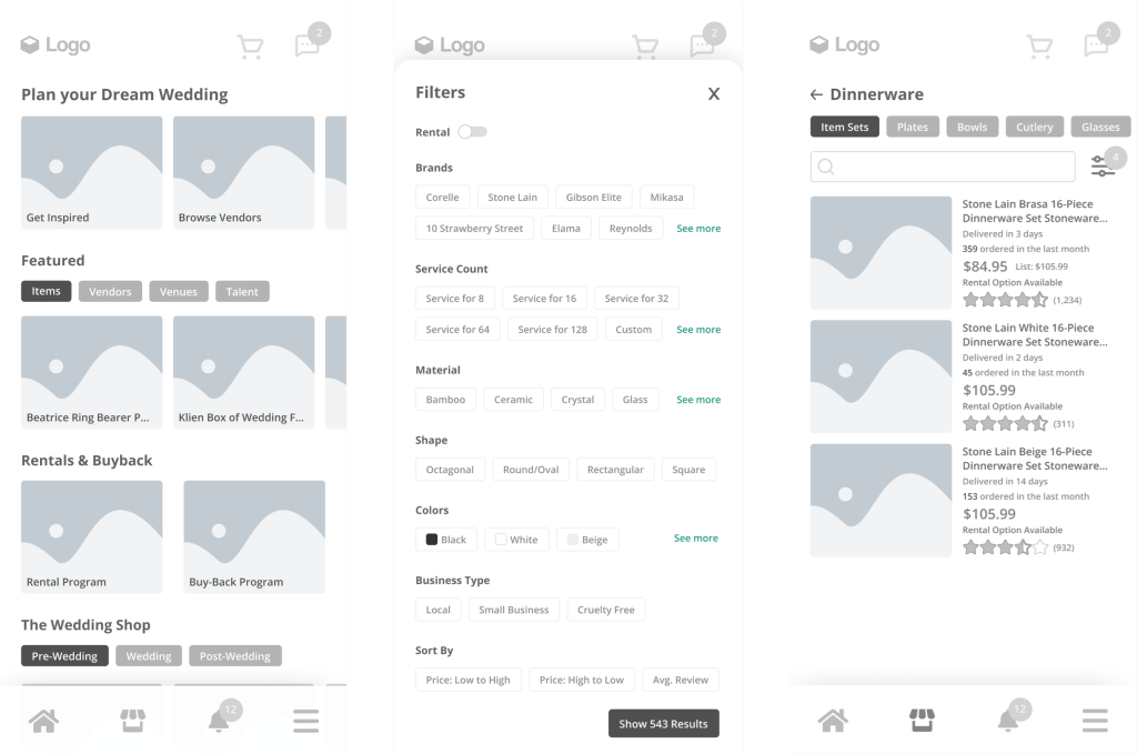
Here is the prototype we created for the site. We designed it as a concept for mobile so it looks absurdly small on a desktop display, but it’s functional, so enjoy poking around.
Everyone has been a part of group projects that didn’t function well together. Thankfully, this wasn’t one of those situations, which is part of the reason I chose to showcase our work in my portfolio. Our entire design process: research, wireframing, testing, iterating, and designing was well thought out and executed. Although the work was for a class and we had no real metrics to test against, we benefited with additional time and space to showcase parts of the design process I usually don’t have the opportunity to conduct for a company, such as card sorting activities and an extensive testing process. I’m grateful to my group and to the course for the opportunity to showcase such a through design process.