I reached out to the founder of HelmBot, Graham Talley, as I was researching the viability of constructing and owning a float center. Graham and his partner Ashkahn founded Portland, Oregon’s first Float Tank center. Together, they took their learnings to found a mentoring company dedicated toward helping others start float tank centers across the country and the world. Graham used this mentee base and his status as a leader in the space to hire a software engineering team to create HelmBot, a scheduling tool for float centers. HelmBot’s scheduling and float center maintenance configuration was the first of its kind and diverged significantly from closest scheduling tool MindBody, a SaaS app for massage therapy centers.
I was interested in getting access to some of the mentoring materials Graham created, specifically the float center construction plan he and Ashkahn developed to ensure proper sound proofing and privacy for float centers while also resisting the corrosive components that salt and water can have on a building. Rather than pay the multi-thousand dollar fee to gain access to the materials, I offered a trade of services, a heuristic analysis of HelmBot in exchange for access to the construction materials. Graham accepted the offer and I got to work.
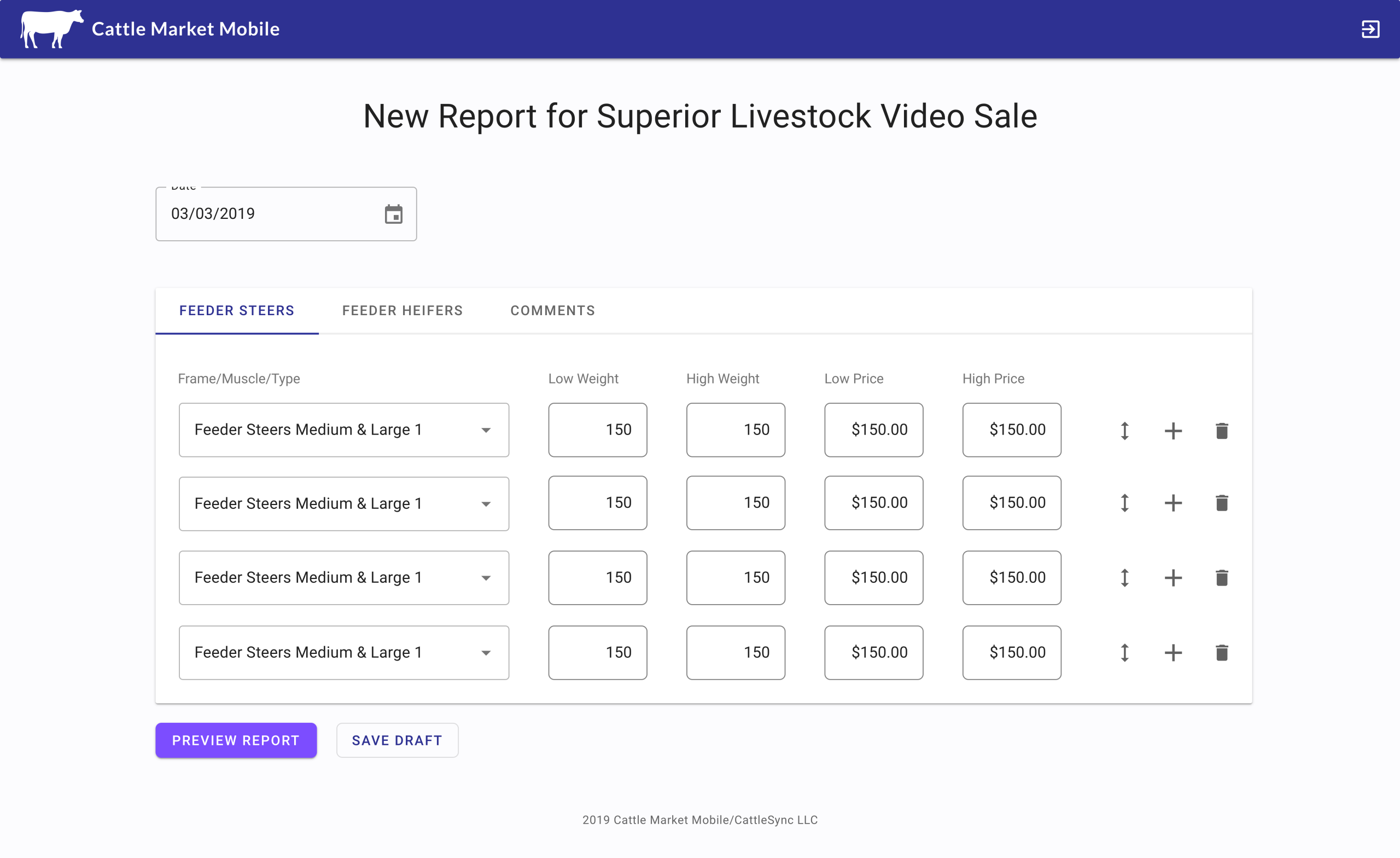
It was clear on first access to the software that it was enormous and complex. The screens and tasks I examined were:
Click here to see the entirety of the heuristic analysis.
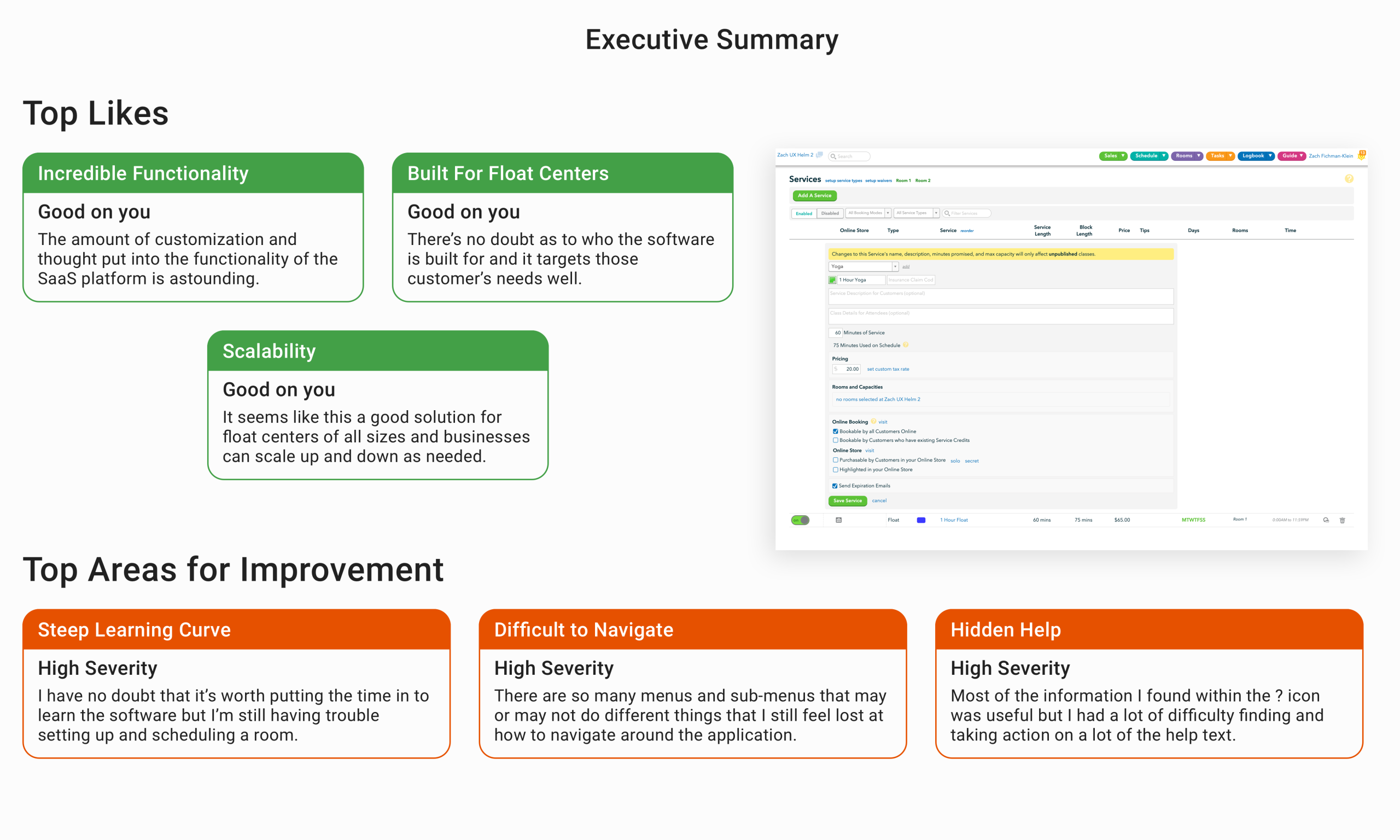
As I wrote in the summary, the primary strengths of the app are that it has an incredible amount of functionality, particularly given the small team Graham put together. The software stayed true to it’s audience, float centers, with little bloat for other functions. It also seemed scalable both for float centers of different sizes with very little hard coded content within the app.
On the negative side, the software had a steep learning curve, particularly for power users hoping to utilize rules and advanced scheduling functionality. Navigation was a major issue with a large number of menus in a variety of places. The ? mark icons contained useful information, but the icon itself was low contrast with the white background and the icon was placed in a myriad of places within the application.
The high severity issues that I found were:
Problem: The ‘Make Reservation’ button on the scheduling page looks clickable, but on click an error message ‘Please enter a more complex password’ populates.
Solution: If the button isn’t clickable, it should be readily apparent that it is in an unclickable state. A universal known signal is that the button is greyed out and doesn’t animate on hover. Additionally, the error message isn’t consistent with the action I performed. If there is an error, ensure the notification is pertinent to the action the user performs.
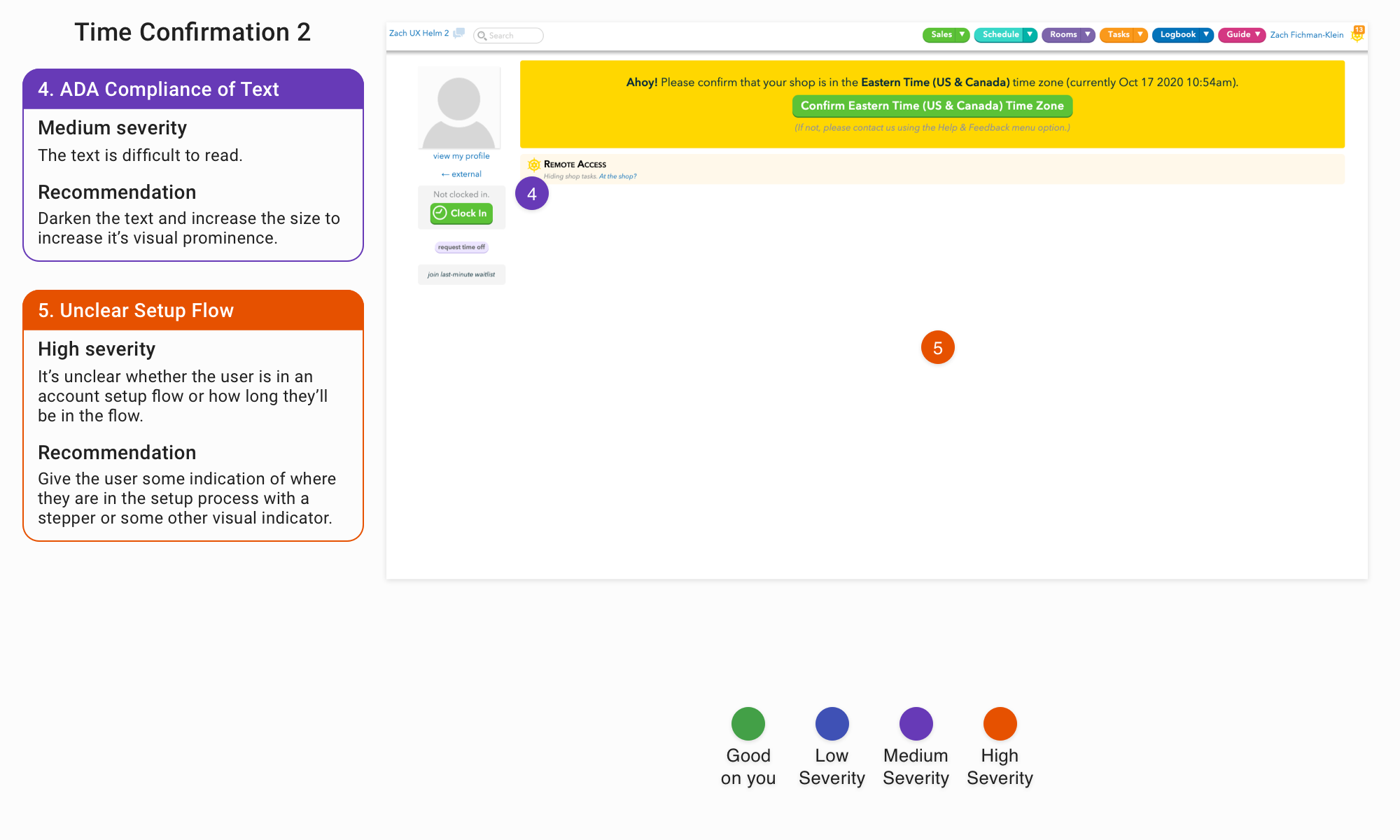
Problem: It is unclear whether the user is in a setup flow and if they are, it’s unclear how long that flow will take.
Solution: Give the user some indication that they’re in a setup process with a stepper or some other commonly used visual indicator.
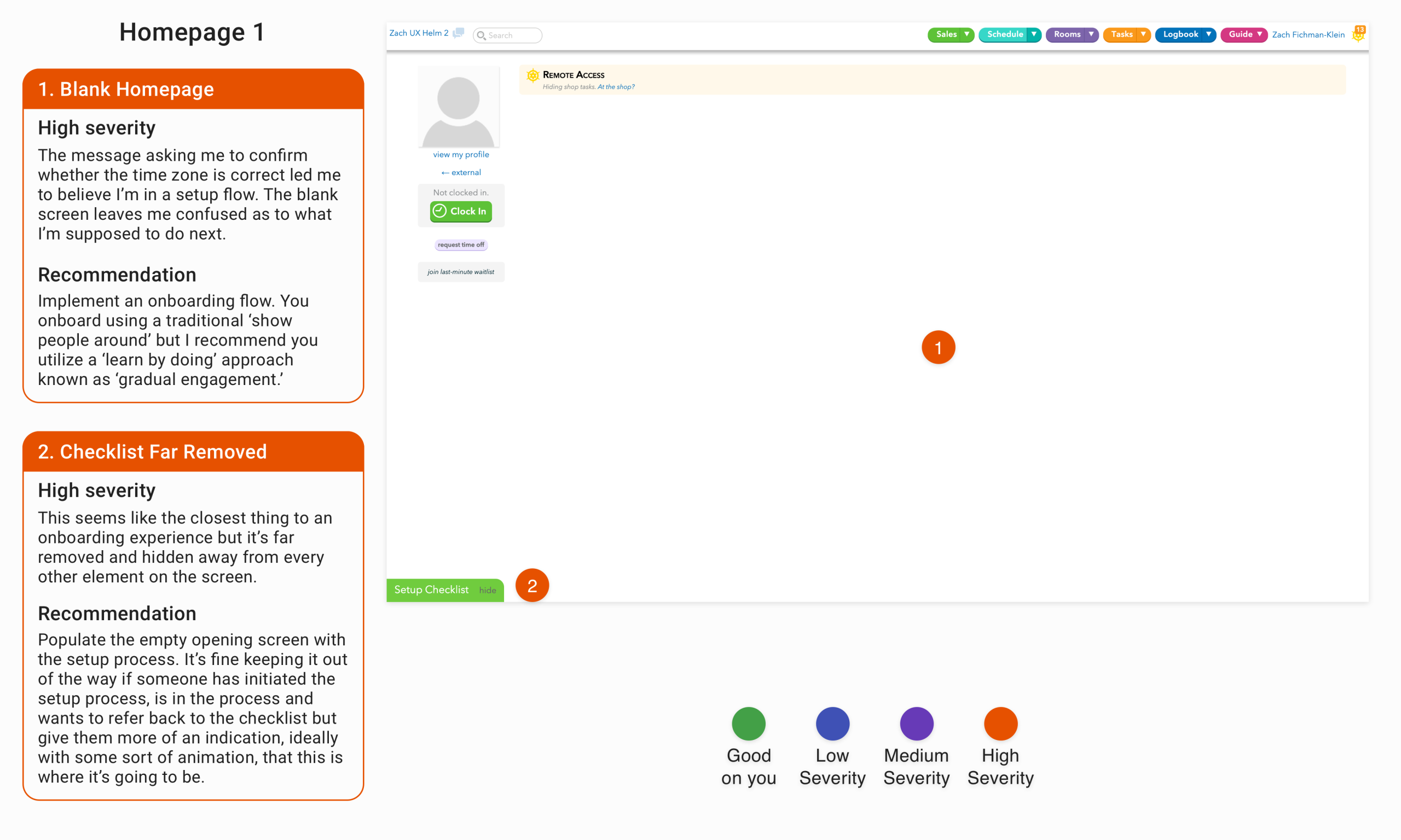
Problem: A pop-up message asked me to confirm whether the time zone was correct, leading me to believe I was in a setup flow, only to get taken to this blank screen. There doesn’t seem to be an obvious way to continue.
Solution: Create a setup process to help onboard people into the software and make it readily apparent on this screen.
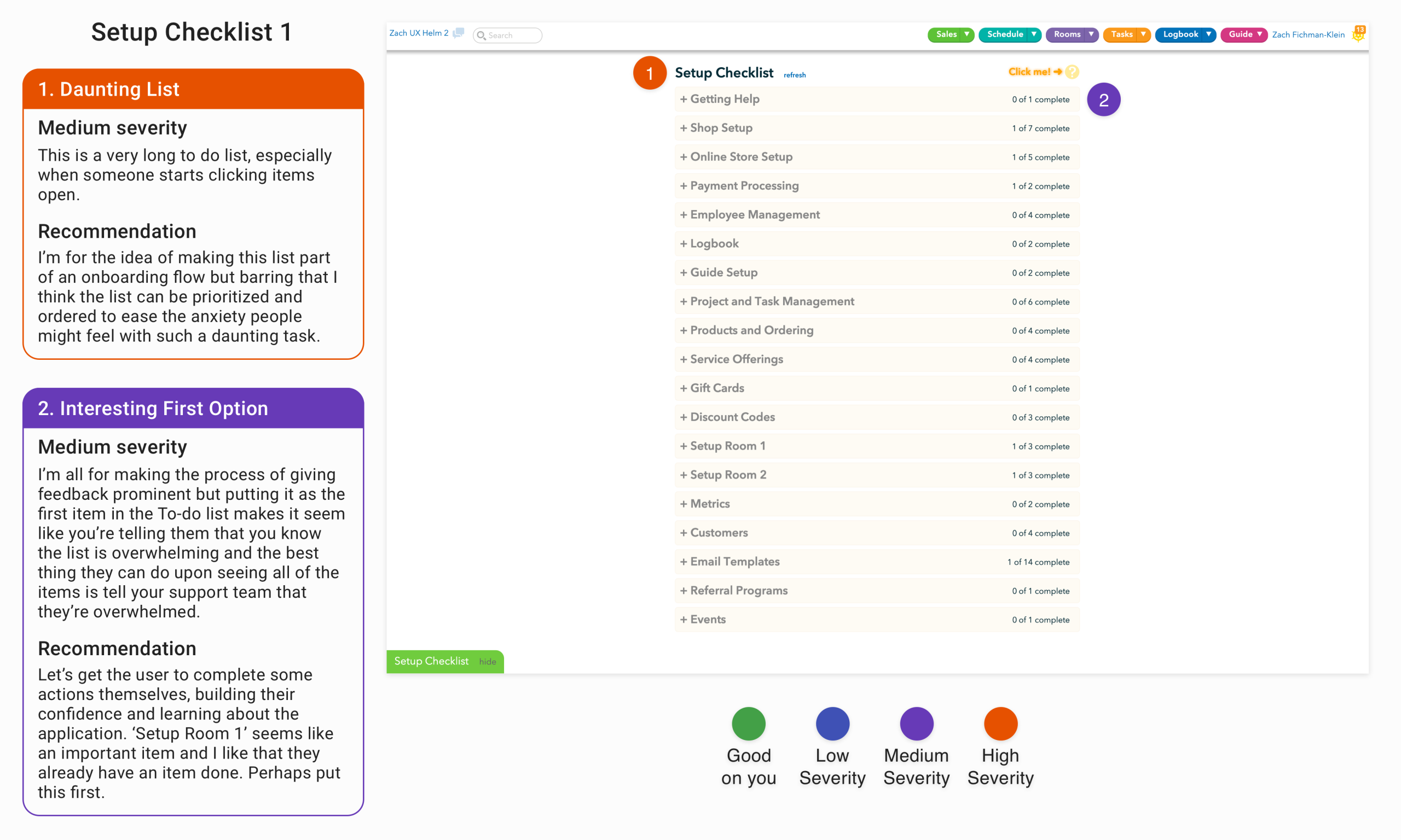
Problem: This is such a long list that seems so daunting that the user might abandon the task rather than complete the first item.
Solution: Chunk differently. Prioritize items in the list that are the most important to complete rather than grouping items by subject area. Set the unimportant items in the setup list to be completed at the user’s leisure rather than during the setup process.
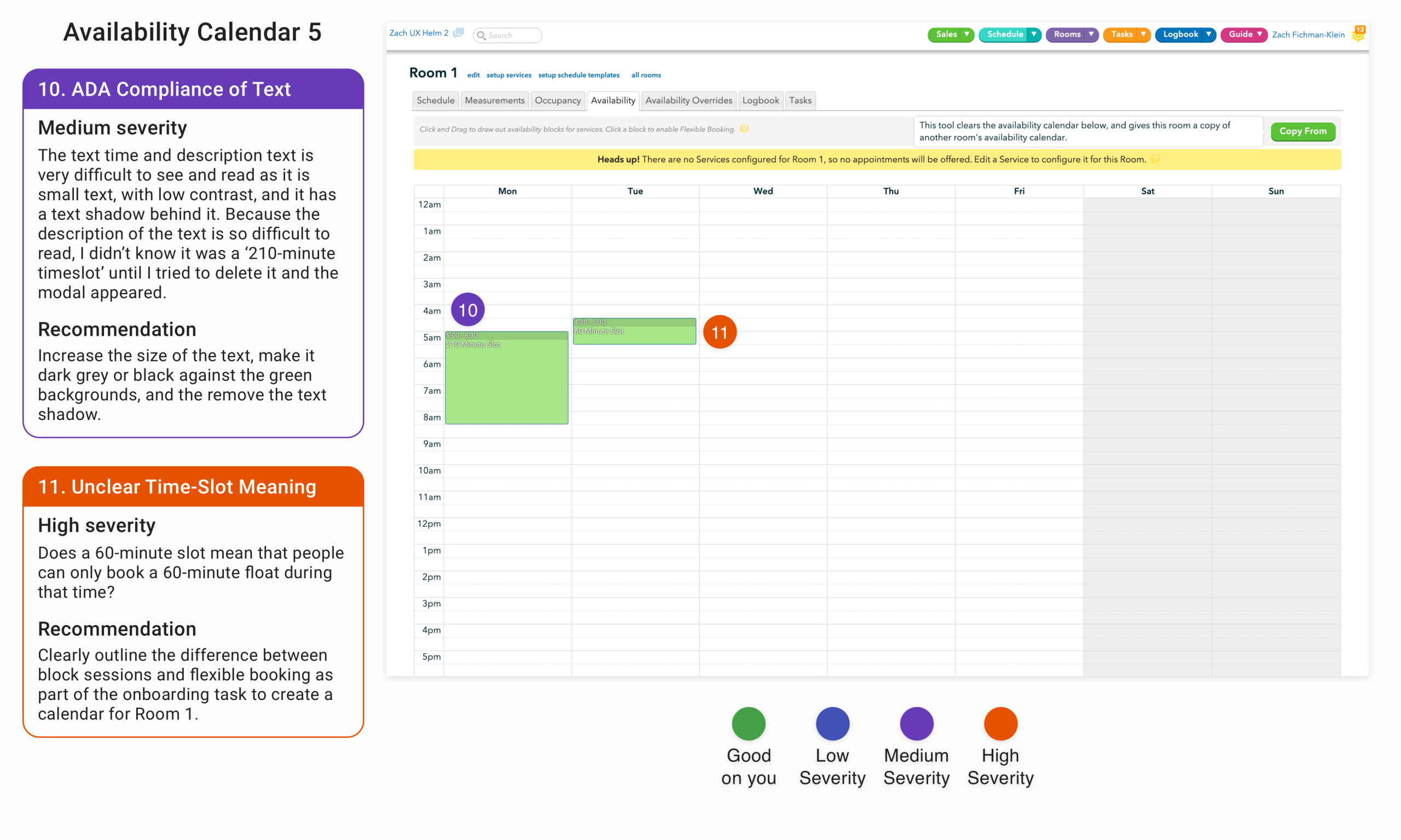
Problem: It is unclear what type and amount of time the administrator is giving a customer access to book a float given the unclear distinction between block sessions and flexible booking during the onboarding process.
Solution: Clearly distinguish the differences between block sessions and flexible booking sessions during the onboarding process and relate those differences both functionally and visually within the calendar interface.
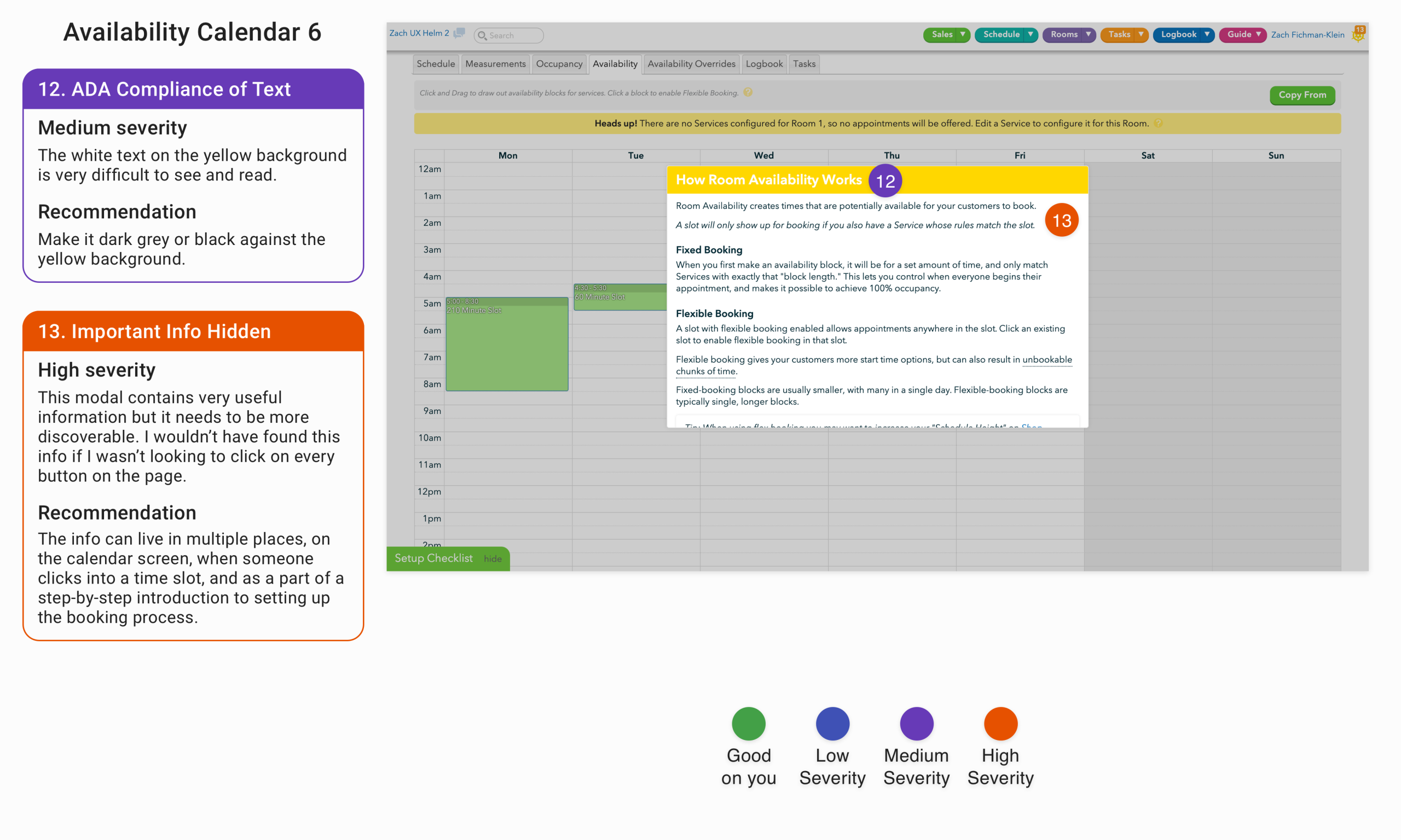
Problem: As I noted above the differences between fixed-booking and flexible booking are important and are not inherently obvious. This info box provides clarity on the differences and how to toggle between the two booking types. The box is just hidden behind a difficult to find info box on the screen.
Solution: Make this important information more visible. The difference between the different booking types should be read and understood during the setup process and be easily accessible information on the calendar screen, such as when someone opens a time slot.
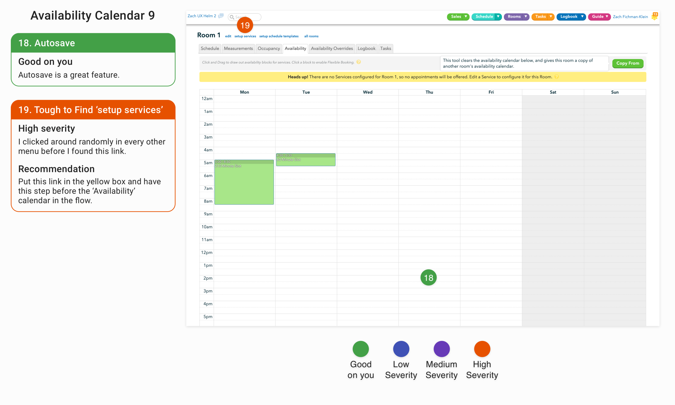
Problem: If the user doesn’t input their service data in the setup flow or they only enter partial data, it’s difficult to find where to enter the services they offer.
Solution: Put a call to action in the notification box that informs the administrator that there are currently no services enabled for customers to book.
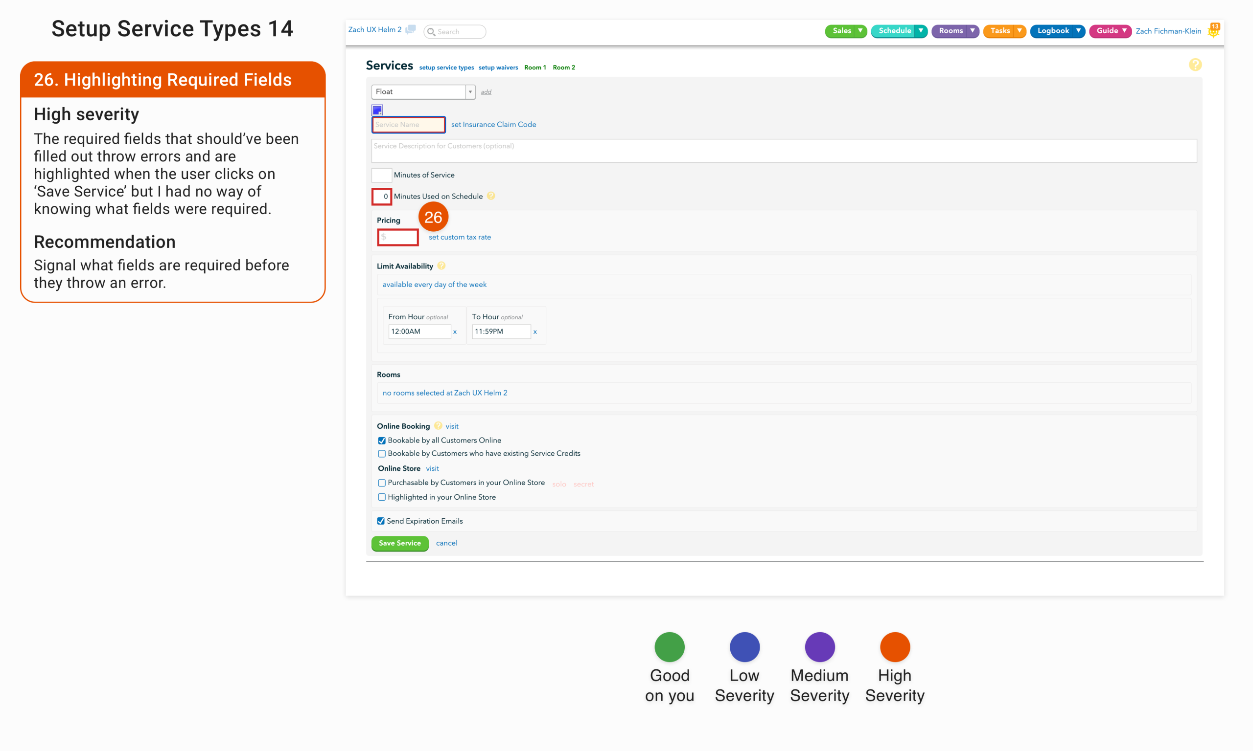
Problem: There is no indication that the highlighted fields were required before throwing an error upon submission.
Solution: Have the universal star icon or ‘required’ text by the fields that are required at data entry.
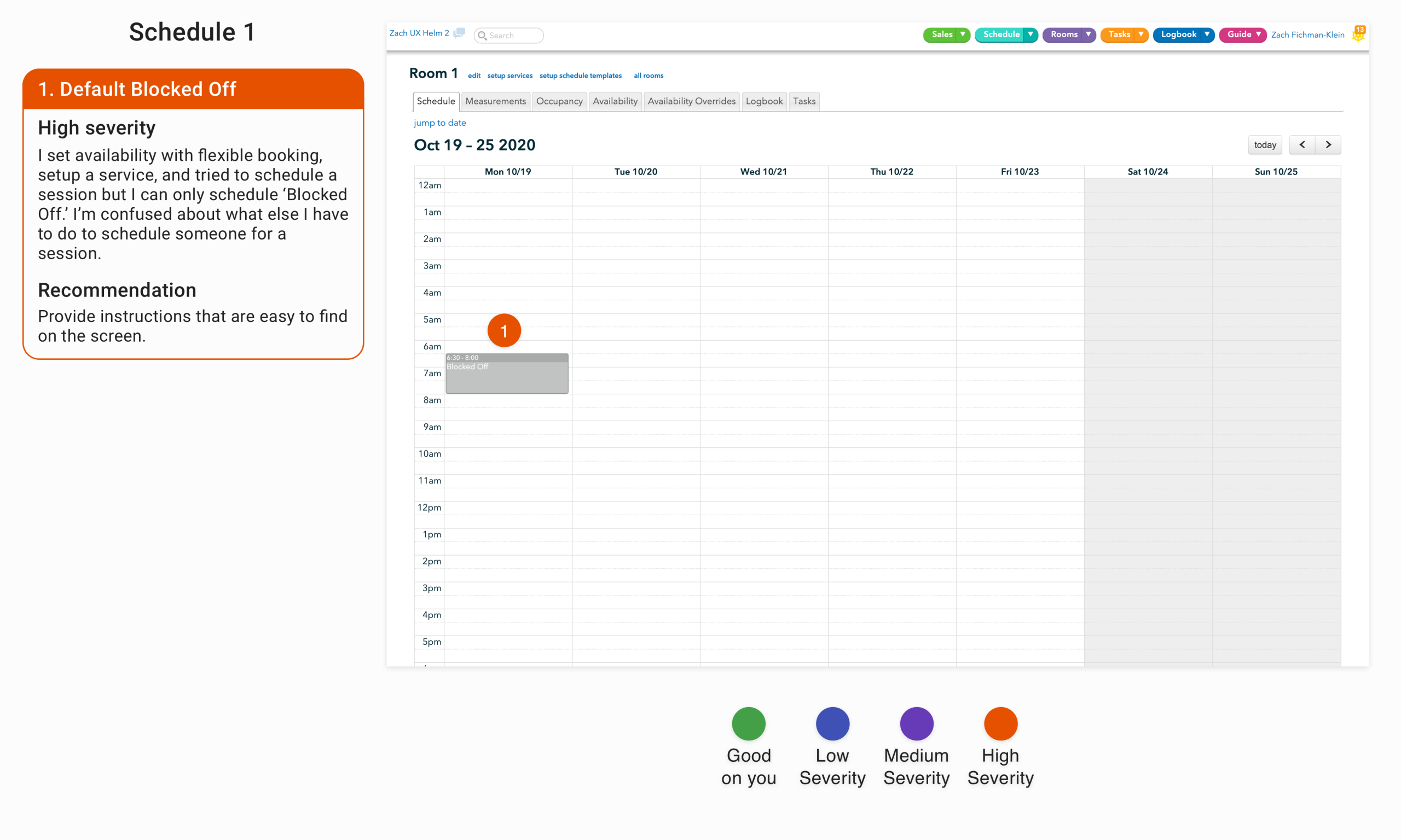
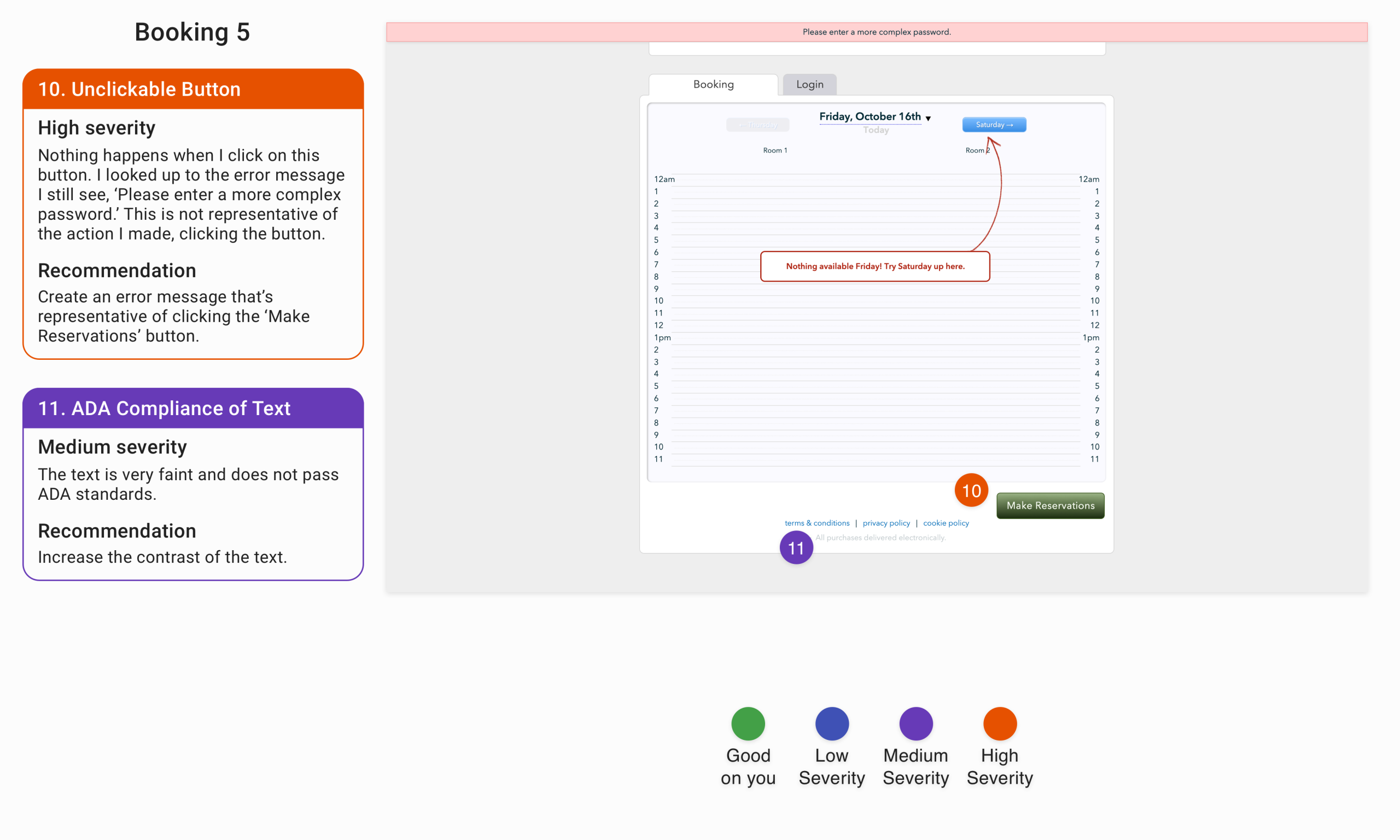
Problem: After setting up availability with flexible booking, setting up services and attempting to schedule a session, the only action that’s available is to block off a time slot. It’s unclear what ‘block off’ means and whether the administrator successfully booked a session.
Solution: Clarify what ‘blocked off’ means before the user has to submit. If the session hasn’t been scheduled, or cannot be scheduled, provide rationale.
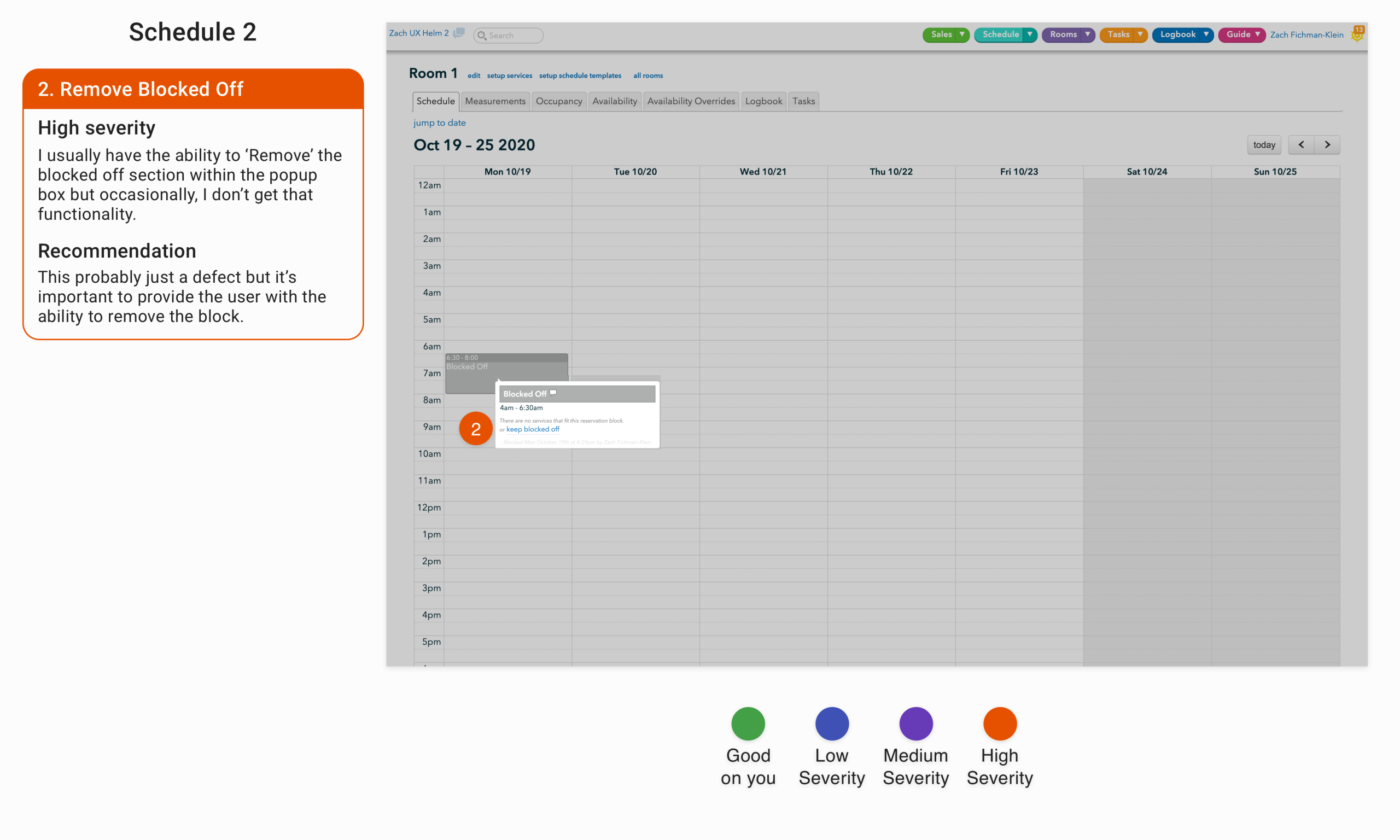
Problem: A pop-up appears on click of the blocked off area, which only displays a remove blocked off text-button on occasion.
Solution: This is probably a defect, since there is no apparent difference between different blocked off areas, but it’s essential to provide users the ability to undo the action.
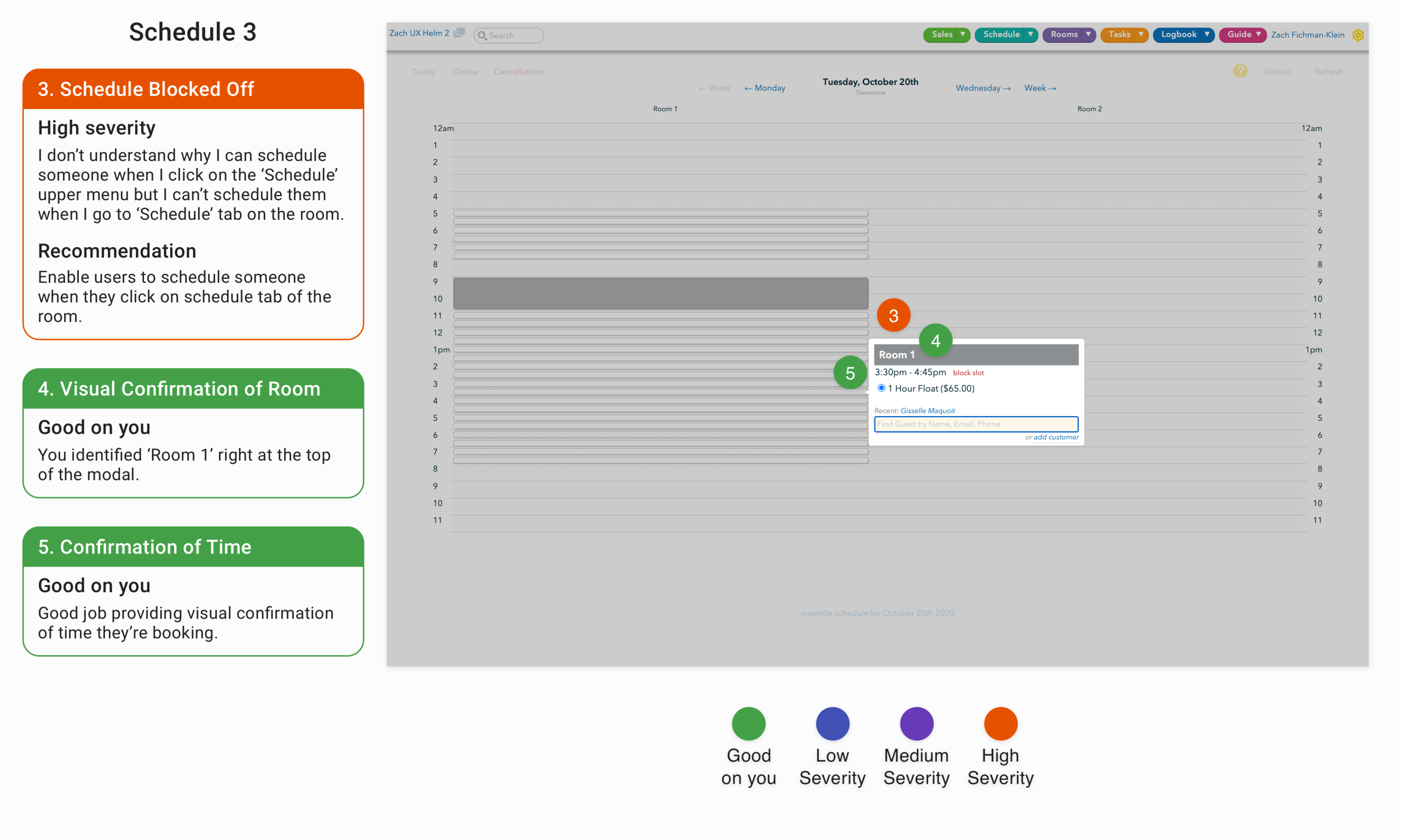
Problem: Users are able to schedule customers when they click on the ‘Schedule’ tab in the upper menu, but they’re not able to schedule customers directly on the room schedule calendar screen.
Solution: Provide the ability for users to schedule customers directly on the room schedule calendar screen.
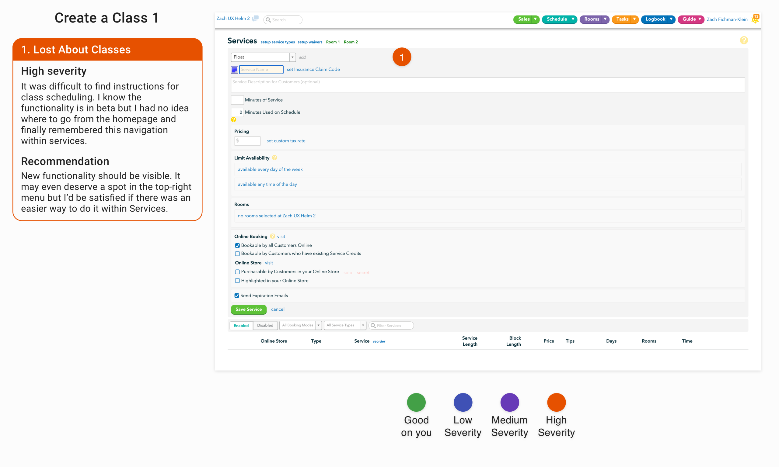
Problem: The ability to create, schedule, and allow customers to book classes was in beta during the analysis. Despite it being new functionality, it was difficult to discover how to navigate to the page.
Solution: Providing a clear menu structure is one of my overall recommendations, but new functionality should be brought to the user’s attention clearly. It should be made more visible and clearly accessible.
These were just the issues I categorized as severe. In total I had 133 callouts. Some of those were positive. I always intersperse some positive findings with the negative to note the aspects of the interface they succeeded on but also to lighten the mood when I’m going through the presentation, but there were clear issues that impeded users from navigating, interacting with and using the interface.
Thankfully, Graham and his product manager understood that when they logged onto the call where I presented my findings. Midway through my presentation Graham mentioned that they had independently identified many of the issues I was presenting and already had tickets in queue. He thanked me though, for presenting some new issues and for validating the issues they had already identified. It provided some assurance that my work wouldn’t be in vain and brought me experience as an independent consultant for unfamiliar software.