As kids my sister, cousin, and myself would play store where we would make crafts out of origami, beads and the like and sell our wares to my parents, aunt, uncle, and to our grandparents. We named our store ZSS, standing for Zach, Sara, and Susie. They had to buy our products of course, but that desire to own my own business and selling products of my own never left my mind, despite the twists and turns life took to get there.
In 2015, while I was still living and working in Saudi Arabia, I stumbled on a course that taught people how to sell products on Amazon. The course was designed and run by a person named Jim Cockrum. He focused on helping people learn the basics of selling on Amazon with minimal upfront investment. I was interested, but back in the mid 2010’s it wasn’t feasible to get the business going remotely living abroad, so I kept it in the back of my mind.
I found an opportunity to open up shop in 2023 just after my daughter turned two and my wife, daughter and I finished our trip around the world. I had ramped my coursework up at grad school finishing up my degree in Human Factors in Information Design, but since I had left my job at Intralinks, I still had some time to focus on researching, designing and developing a physical product.
I started out small, finding success selling replenishable items on Amazon as I learned the system and refined my sourcing, packaging and shipping processes. Once, I’d sold close to $20,000 of product per month, I felt like I was ready to venture into creating my own products. Jim Cockrum and his coaching team proved integral yet again, linking me up with John VanDerMeulen, a consultant who specializes with helping people identify, launch, and optimize selling products on Amazon.
Our first call was invigorating. He gave a brief overview of his backstory then outlined the key areas we’d focus on throughout the process:
Obviously, there are a lot of substeps I’m omitting but he gave me an overview and tour of the spreadsheet he uses and provides his mentees for evaluating the viability of products, including the amount of searches the main keyword and the supplementary keywords get per month, the estimate cost of manufacturing the product, the potential selling price of the product, the estimated shipping cost, the current competitiveness of other listings, and the customizability of the product. The key to getting all of this data was SaaS software called Helium 10. There were 20+ sub-applications related to different parts of the product launch lifecycle I wouldn’t be using but identifying product leads was also a good introduction to the software I’d be using for much of the process.
It was as much of an idea generation exercise as I’d ever done. I didn’t start from a completely blank slate, since I had a few ideas, but our initial goal was for me to come up with ~20 products I felt had a real chance of being sellable. I’d rank the products before our next meeting and then John would grade them with me on a scale of 1-10 on how viable or potentially successful they could be for me to sell.
I’m a naturally competitive person so I didn’t anticipate searching for product leads being as fun as it was. It helped that I felt like I found some success right away, looking at organization systems for home goods. That led me to door mounted organization systems, then to fabric privacy curtains and holding systems for food and beverage pairings. It wasn’t until I was looking at classroom organization systems that I stumbled upon wedding card boxes as a potential product. I delved in further and found that wooden wedding card boxes had it’s own huge subset of associated keywords.
When it came time to rank ideas John acknowledged that there were a few viable candidates but he ranked the card boxes as the top idea to pursue. There were a number of attractive features about the product, it sold at the correct price point, it was relatively cheap to manufacture, it had a wide potential for customizability, there weren’t thousands of reviews for one or two products that dominated the market, only one box on the market had greater than a 4.4 star rating, and there were a slew of suppliers I could contact.
We agreed that I’d send out a few requests to suppliers and wait to hear back. Predictably, many of them replied immediately, eager for new business. Per John’s advice I engaged in an in depth discussion with the 5 suppliers I felt were the best fit, not just to gauge whether they could provide the type of box I wanted, but more to gauge their willingness to communicate and customize the box according to my needs.
During this communication process I identified the wooden card boxes that sold the most and delved into their design and their reviews, making a list of both the positive and negative aspects of each box. A few of the major issues I found were that people weren’t enthusiastic about assembling the box themselves with some people mentioning that it was a very difficult process where they needed a third hand. Other people mentioned that boxes got chipped in shipping and that the slot was too thin for their guests to put the card in the slot.
Two suppliers emerged as the most likely to provide the type of box I wanted so I gave them the specifications, example images, and guidelines then waited for them to send their samples. This was still part of my ideation process so I experimented a bit with a few different styles of box based one what was on the market on my major keyword being ‘wooden wedding card box.
(Need photographs of all 4 sample boxes currently in the closet)
My major competitor, and the wooden card box that sold the most by far, was a dark brown box that people assembled themselves. I bought it and assembled it in my kitchen. It was made of flimsy plywood that chipped easily and fit together kind of like Lincoln logs. The top was warped too which made it very difficult to assemble, but didn’t seem to affect the look once put together. I couldn’t believe it was even rated at 4.3 stars. It had a few copycats with minor variations but John and I agreed that based on the reviews, it was probably best from a customer service standpoint to have the box ship and arrive preassembled.
It took two weeks to get the samples but the second one that arrived seemed like far better quality wood and it was manufactured with more precision. I had communicated better with them too. I met with John again. He agreed, but this was where our processes diverged. He was used to placing an order right and initiating the product page creating cycle on Amazon.
I had worked in UX for too long and had gotten through too much of grad school to not test and idea so I logged onto my account on UserInterviews.com and initiated a plan to interview five people. My overall goal was to check the direction I was heading with the ideas I’d already generated for the wooden wedding card box.
Since I was designing a wedding card box my primary audience were the brides who would be potentially purchasing or at least would be the final decision maker for the wedding box purchase. My rationale for the questions were as follows:
I’d never used user interviews for such a specific subset of people so I was unsure how long it would take to find acceptable candidates. Either I was lucky or the pool of candidates was far wider than I thought because I started getting candidates that fit my criteria within hours. I had scheduled five interviews by the same time the next day for the following week, with a few more people lined up should some in the first batch cancel.
My plan was as such. I’d warm them up by asking them to tell me about their wedding, delving into how many people they expected to be there, whether they used a wedding planner, and whether they had a theme, then I’d review the pre-interview task I set for them asking them to draw their reception area in a back of the napkin style sketch. The pre-interview task is meant to be a bit fun, but also to get the participant’s minds in their reception planning mindset. If they didn’t complete the task, it wouldn’t make a huge difference for the rest of the interview, but it did help prime them and allowed me to ask more pointed questions about the accessories they planned on using and about the wedding card box they planned on using. My follow follow up questions after asking them to describe the type of wedding box they plan on having were:
I asked broader questions then delved into more pointed questions as is industry, practice, in such interview interviews but I am a believer in asking, a broad question that asked participants to use their imagination or use visualization skills first, search is asking participants to describe the type of wedding box they planned on having. I believe that reduces the amount of bias. I’m priming them with my questions and it’s interesting to hear participants list important qualities and features before they see any material.
Then I shared and gave control of my screen and we went through a couple of the Amazon pages of boxes I had identified as primary competitors. My major goal was to examine what they thought of the boxes themselves in the specific features that differentiated each box such as size, color, materials, latches and lettering. Then we delve into what they thought of the cost of the box, how they examined reviews and what they thought of the reviews of the specific box. My specific line of questioning for each box was as such:
After we went through the fourth Amazon box I minimized my chrome browser and said that I had created a page with images of all the boxes we had viewed plus a few other boxes, then ask them to rank the boxes one through eight with one being the highest and eight being the lowest. Aside from figuring out which boxes they like the most my goal was to identify the specific qualities that made different boxes, more or less attractive, essentially ranking the importance of the box qualities as well. To assess I asked a number of follow up questions:
Once I got the answers I sought I asked my final box question whether they cared about the interiors of the box being finished vs. unfinished then whether they had anything else to share that we hadn’t covered today before thanking them for their time and assuring them that I would mark the session as complete.
In total, I conducted six user interviews over the course of a week, which in aggregate prevented me from making a slew of enormous mistakes. My biggest lessons were:
Although people liked the idea of using real wood for the wedding card boxes, most of the participants wanted the box to be painted white rather than the brown paint or stain almost all of the wooden card boxes sold on Amazon were. Many of them thought that a brown wooden box would be good for a more rustic wedding venue, like one in a barn, but it wasn’t the vibe they were going for.
Every participant hated the font I’d chosen of the ‘Cards’ text for the sample boxes and they loved the ‘Cards’ text of my bestselling major competitor.
If the participants could make the box white, they were split on the color of the text. The participants who had gold as a primary color in their wedding wanted the lettering to be gold. A couple other participants thought black would look better. One participant who wanted gold did acknowledge that black lettering would be more versatile if they didn’t have gold in their color palette. One other participant did note that she did not want any words on the card box.
Four out of the six participant wanted there to be a lock on the box so badly that even if they loved everything else about a box, they would refuse to purchase it if there was no way to put a lock on it. It didn’t have to be a large or secure lock, but it needed to be something more than a latch. (A side note was when I mentioned this to my sister who lived and was getting married in Israel, she mentioned that all wedding card boxes at Israeli weddings had a lock.) One participant told a story where she went to a friend’s wedding and her friend’s uncle stole money out of the unlocked wedding box. Thankfully, they knew who did it immediately and got the money and cards back before he made it out the door.
Even when I asked a follow-up question of opening up the box as a workaround, many participants showed real signs of distress that their guests would be able to open the box at all. Related to this, most brides to be didn’t care whether the box was painted on the interior since none of their guests would see the interior of the box.
Most brides had a plan for emptying the wedding card box periodically throughout the reception with the majority tagging their mother with the task. The only woman I spoke with who just had her wedding said that she did get a box with a lock on it, lost the key to the lock during the reception, and was struggling to finagle the box open with a bobby pin on her wedding night. She said, “I thought that it was a flimsy looking lock but I couldn’t get it open with the bobby pin, so maybe it wasn’t as flimsy as I thought. Apparently a guest found it on the ground and handed it to my husband during the reception.”
The two participants who didn’t want the box with a lock liked my major competitor’s latchless, jigsaw assembled box. One of them noted that although they didn’t want a box with a lock they understood why someone would want to have a lock on the box.
It was important to have a long and wide slot to put the cards into so guests weren’t struggling to put their cards in and since there would be a lock, they wouldn’t be able to open the box.
None of the participants minded assembling the box themselves. One of them preferred to have it shipped to her preassembled but it wasn’t a deal-breaker if she had to do it herself.
There was a strong preference for a short squat box over a tall thin box. One participant noted that they could see cards stacking nicely in a squat box and thought the cards would get damaged if they were upright, with people trying to stuff more cards.
Participants loved how my major competitor gave a size reference for their box by taking a picture of it on a chair. They also liked how competitors had an image with the dimensions of the boxes, but many were unable to visualize the size of the box without an external reference.
Every participant looked at the reviews on Amazon before purchasing the box, but many gave the reviews a cursory glance. A number of the participants also gave a fair bit of leeway for items having negative reviews for assembly issues, nicks and scratches. Many did like and look for pictures and videos in the reviews, feeling they gave a far more realistic representation of what the boxes looked like in a comparable setting.
The prices of the boxes I showed people ranged from $24.99 to $39.99 but price didn’t seem to be an enormous barrier or a deciding point on whether they would choose one box over another. A number of people noted that it mattered far more whether the box matched their theme than saving a few dollars on the cost of the item.
I was glad I created the final step of the interview, asking participants to rank boxes one to seven while talking aloud giving their reasoning.
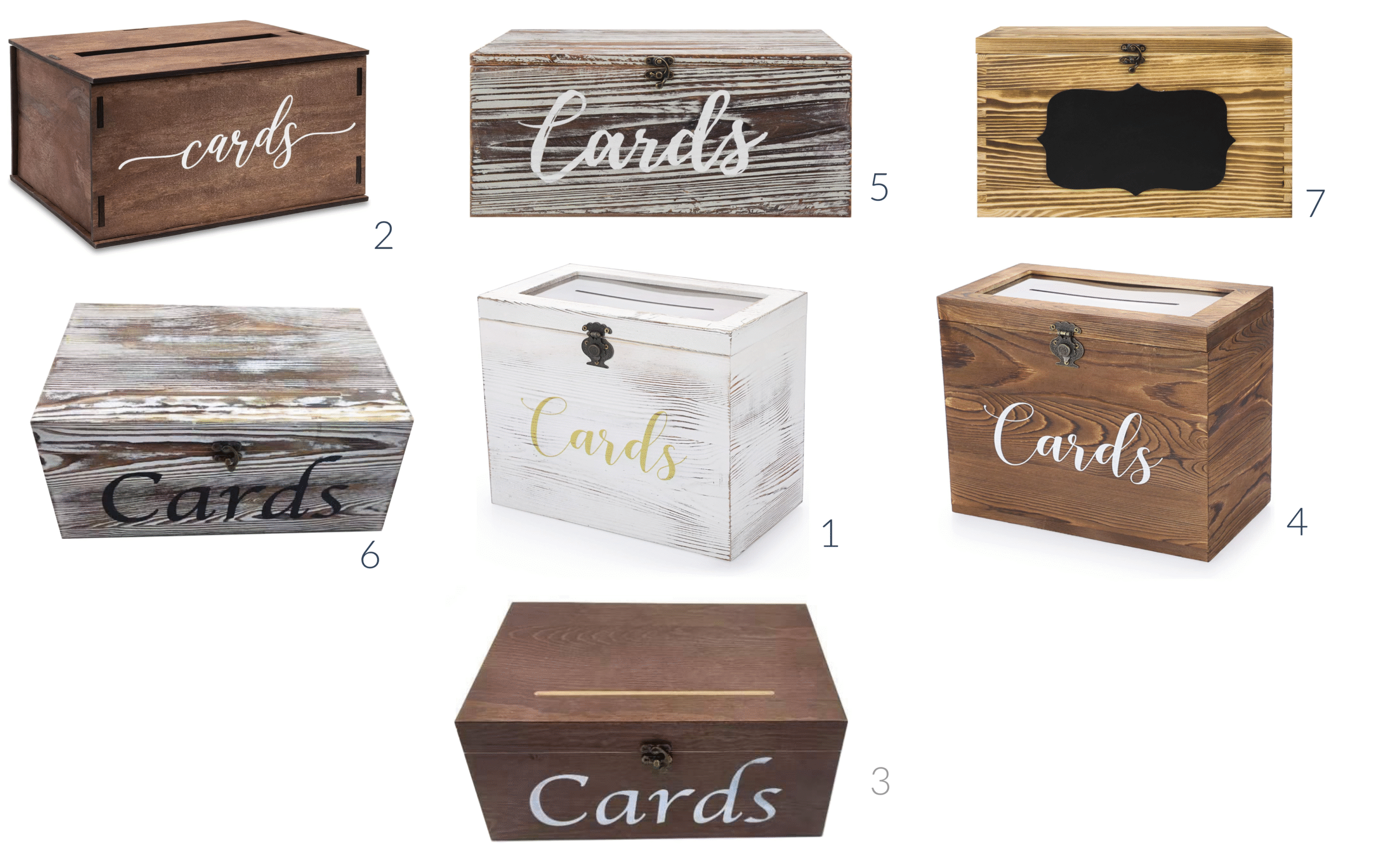
Here is an example of one participant’s ranking:
There was remarkable consistency in participants ranking, with the second ranked box for this participant ranking as the top box for most participants and in the top three for all participants. The seventh ranked as the worst box for every participant I interviewed. People hated box number seven for a multitude of reasons. First, although one person liked the ‘zebra like’ staining of the wood she noted that it was definitely not suitable for a wedding. Participants also didn’t like the size or the premise of the chalkboard on the front of the box. It was one of the last boxes where we viewed the Amazon listing page so many people also knew people complained about the poor quality of it’s construction.
People had similar concerns about the plastic see-through top of boxes one and four. Most participants also didn’t like the idea of their guests being able to look into a see-through top. The pictures the company chose also made the plastic boxes look like it was bowing inwards, not affixed appropriately to the top of the box.
I noted above that people generally didn’t like the white washed look of boxes five and six and that people hated the font I’d had my supplier put on boxes three and six but the font on five didn’t test much better.
When asked to create ‘one box to rule them all’ at the end of the interview everyone chose the font from box two. Most participants would add a lock and those that didn’t liked the latchlessness of box 2. People were split between making the box brown or making it white. The people who made it white wanted it to be completely white, though the majority liked the grain showing. There wasn’t any consistency in what shade of brown people wanted the box to be between two, three, and four. Everyone did love the idea of the wide slot from box two and as previously stated, the top of the box being wood and not see through.
Once I compiled the results I brought my recommended changes to John with a few alternatives. The obvious changes were:
The less obvious potential changes and question were:
John concurred with my analysis and results. Honestly, I felt so stupid for not realizing a number of people wanted the box to be painted white, though it didn’t seem like most of my competition realized it either. It was one of those things though, that as soon as it crossed both John and my minds, it made sense.
The lock and key made sense too but neither John nor I thought that it was as easy to identify the need without conducting the interviews. I’d found one wooden card box that had a lock though it was far more padlock-like and serious looking than what I thought was appropriate for a wedding. It was a delicate balance. When people initially said they wanted the box to be locked I wondered if there was a way to design the box so it had a lock but it wasn’t visible. This idea was attractive to some participants, but a couple of people wanted the lock to be visible to the people in the wedding party. They didn’t want it to be a big, ugly, bulky padlock but they wanted it visible to act as a deterrent to potential thieves. I wasn’t going to satisfy everyone, but if I figured out the right way to lock the box I felt like it could be the difference between success and failure.
We didn’t have much of a conversation about making the slot wider and putting in the top center of the box. It seemed like a logical, easy fix. It was the same with the size and font of the text. The results were unanimous and the testing saved me from potential disaster of the ugliest font imaginable on a box.
John nixed the idea of having people assemble the boxes themselves. Quality was going to be a big issue and shipping the box in pieces left the potential for the separate parts to get warped, cracked, and damaged. Even though it would be far more expensive to ship the constructed box with it’s larger dimensional weight, it was worth the cost, especially since quality issues were an issue with my major competitor and a way I could differentiate my product.
The big question was what color I would make the box. John noted that both brown and white seemed like good choices, agreeing with the participant who said that white with black lettering would appeal to a broader audience but white with gold lettering could be perfect for people with gold in their color palette.
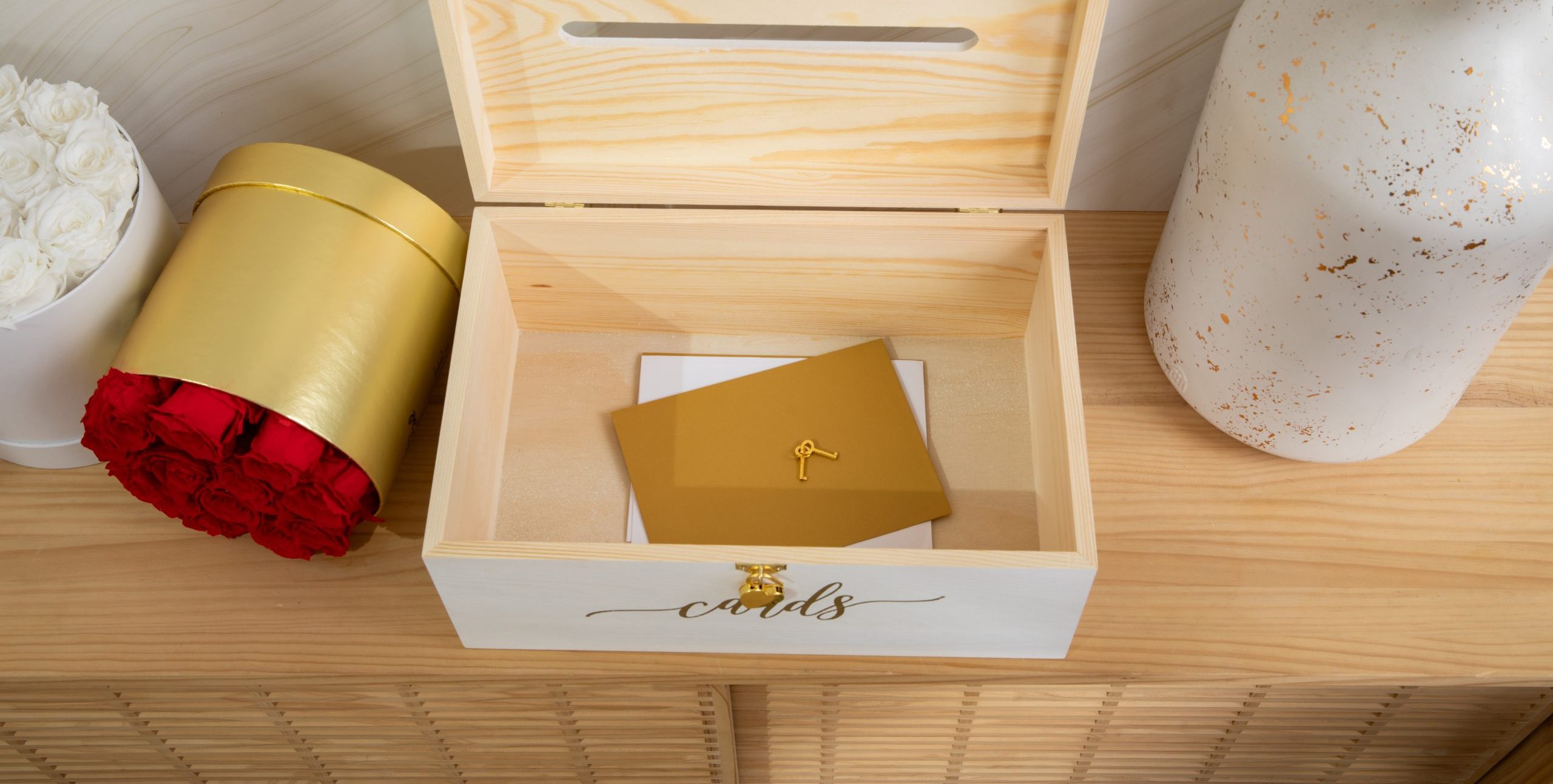
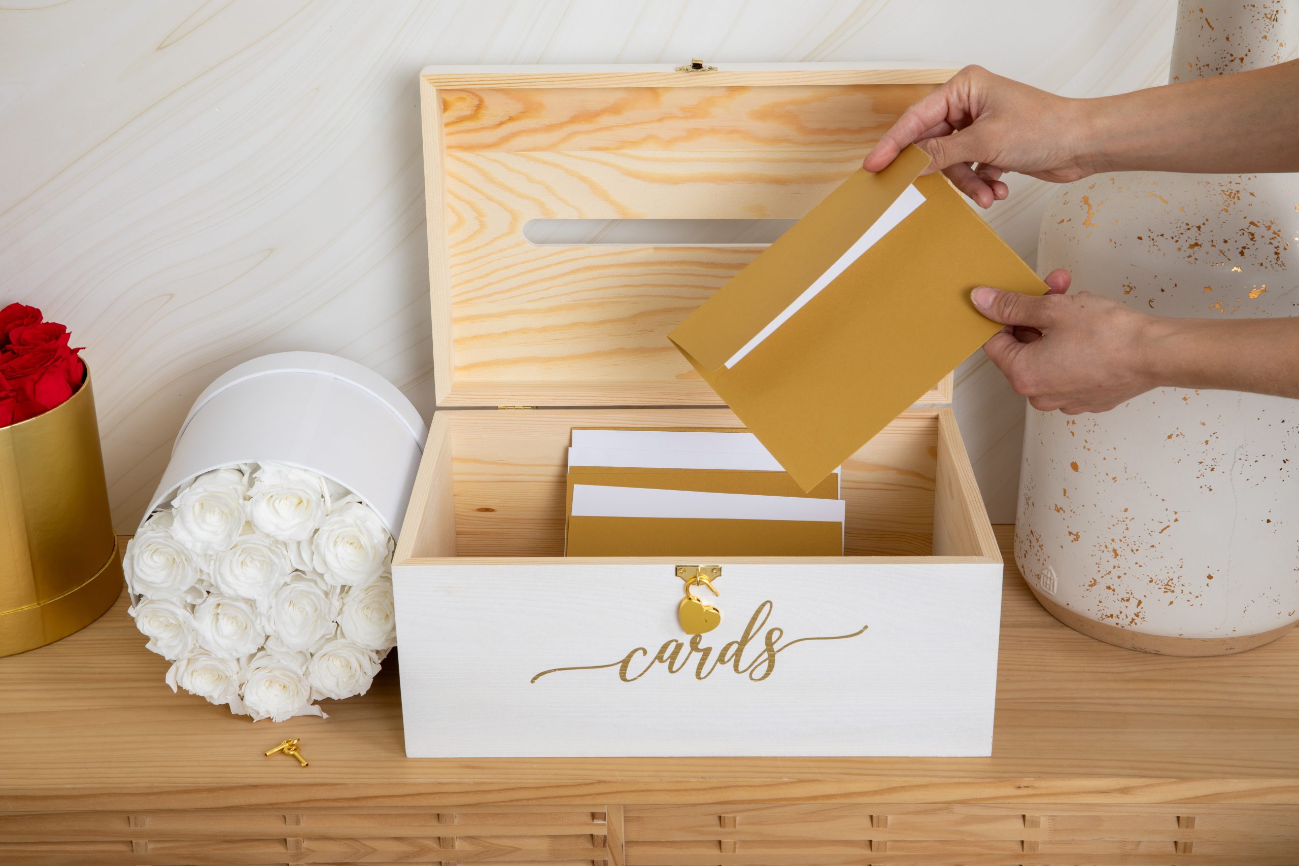
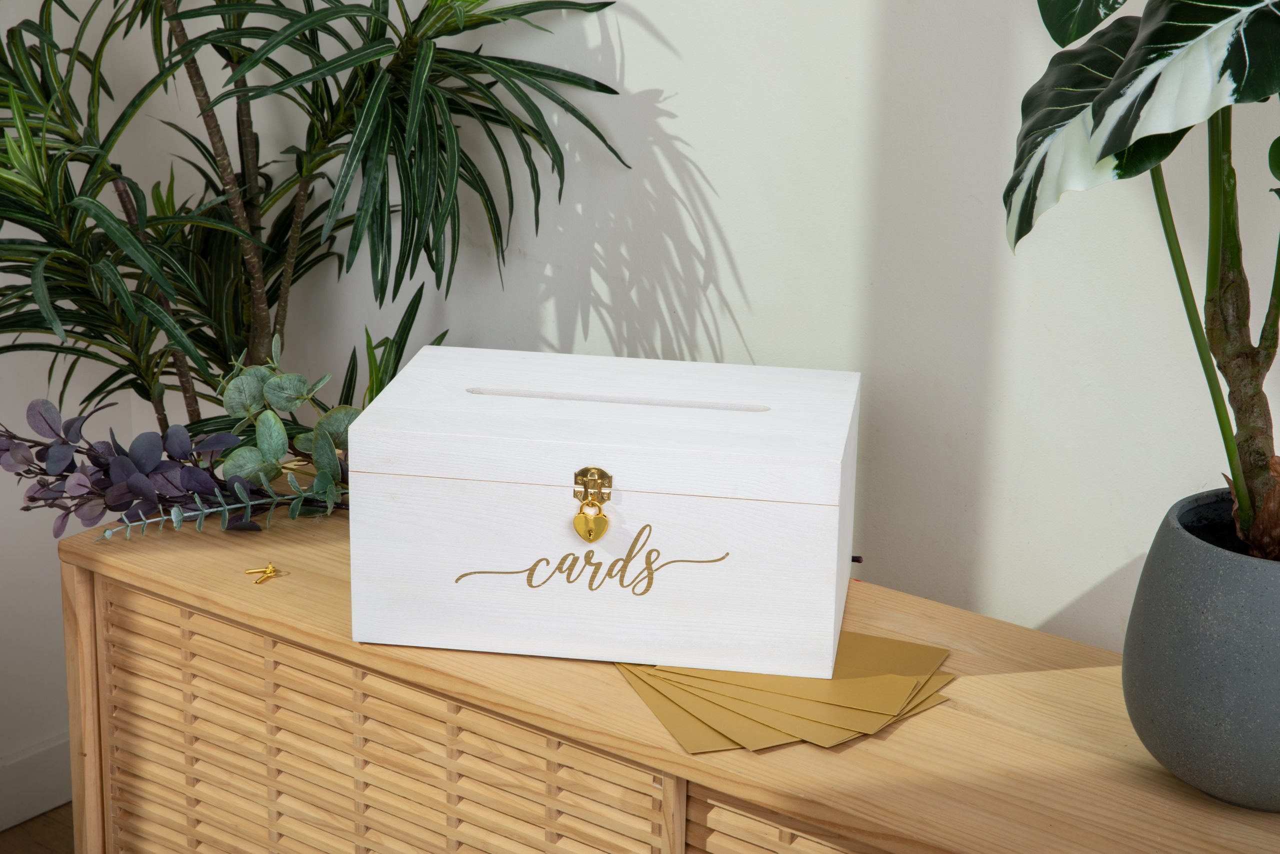
I needed more information, so I contacted my supplier. First, I asked if they could add a lock to the box. They said that they could and sent me back a list of options. One type of lock stood out to me. It was a small heart and there were three different variations listed, gold, silver and a brushed bronze/black lock. The gold looked really good and the silver looked nice too but the brushed bronze lock didn’t go with the wedding vibe I was looking for. The latch looked a bit too much like a medieval chest latch too, but maybe it would look better in person.
I confirmed that they could make the card slot bigger and put it in the center, then I asked whether they could paint the ‘Cards’ text with less translucence on a new version of the brown box.
I’d taken some time to examine the sample boxes they had sent me. The black text on the whitewashed box looked good but the brown paint beneath the white ‘Cards’ text on the brown box showed through. It just needed a couple of more layers of paint to make the text solid, but that was exactly the QA cutting corners problem I was trying to avoid, especially since I had a good alternative. I was going with the white box with a gold lock and key and gold lettering. The white box with silver everything might be a different variation at some point but the silver ‘Cards’ text would blend in too much with the rest of the white box. The white box with black ‘Cards’ written on it wouldn’t work right now because my supplier didn’t have an easy way to get a black heart lock. The silver lock might’ve looked okay, but I was hoping for everything to match, especially for this first launch.
I didn’t want to fork over the money to start mass producing boxes until I was sure every aspect was to my liking so I asked for two more samples, one with the thinnest cut of pine my manufacturer would use and one they recommended. I needed to minimize cost, especially with the amount shipping the completed boxes and the amount I needed to spend on advertising but I didn’t want to compromise quality for the sake of saving a few dollars per box.
I received the boxes two weeks later, confirmed that the thicker wood was the right choice, and put in the deposit for the order. My supplier estimated that it would take about a month to manufacture the boxes and another month to ship the boxes overseas so I had a good bit of time to get everything ready for a successful product launch.
I had a lot to do:
Trademarks can help to protect your ideas from copyright infringement but that’s not the reason most fledgling Amazon sellers file for trademarks. They do it to gain access to Amazon’s Brand Registry, which provides valuable insights into customer behavior, navigation, keyword search terms, and the overall customer journey. To gain access to this Amazon dashboard, Amazon requires proof that the brand filed, but didn’t necessarily get, a trademark. This is an important distinction since it can take many months to over a year for the trademark office to view and approve the trademark request.

I used the brand Jim Cockrum’s company was affiliated with, Humnbird, to submit the trademark request through a trademark lawyer. There wasn’t much to it on my end aside from providing the necessary information and contact details, before getting confirmation from the lawyer that the trademark was submitted. They provided me with the necessary confirmation details which I submitted to Amazon’s Brand Registry portal to get approved.
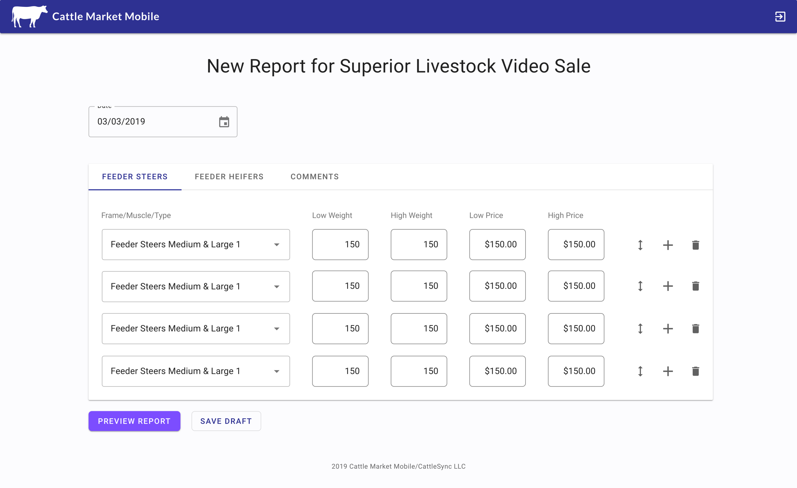
Writing the content for the listing and getting the images taken of the product took the most time but they were also the most important components in having a successful launch. If I didn’t have the appropriate keywords, then the boxes wouldn’t be findable via search. If I didn’t have good pictures, people wouldn’t want to buy the box, even if I optimized the features based on user research.
I went through an extensive process to identify the correct keywords via the suite of products Helium10 had for creating a product listing. The ‘seed keyword’ John and I identified was ‘wedding card box.’ I input the keyword into the SaaS application, which generated a list of similar keywords. I copied the best matches, input the phrase/word into Amazon’s search box, then looked for the product I wanted to emulate most in my own listing.
I opened up a new SaaS application within Helium10, pasted the unique identifier of the product I was emulating, then generated the 10 most likely competitors. This application searches each of these listings for the keywords they are targeting, so I clicked on the ‘Get Keywords’ button and generated a large list of the most important keywords to target. I filtered by search volume of the keyword, competitors rank on the first page of Amazon, and the number of competitors targeting the keyword. I keep saying ‘keyword’ but John instructed me to look for key phrases first, like ‘wooden wedding card box’ and ‘wedding card box with lock.’ I completed a similar process to find the keywords.
Altogether, I generated 10 key phrases and over 300 keywords to target within my listing. There was a lot of overlap between the keywords and the key phrases of course. There were three places where I could put the most important key phrases: the product title, the list of five features underneath the title, and within the mass of text that formed the description. Amazon provided a limited amount of space for each section, which inversely corresponded with the amount of importance it gave to ranking each keyword/keyphrase.
I also couldn’t just put key phrases in an unintelligible manner. They had to mean something, especially within the bullet points. John guided me to make the first three bullet points the three biggest benefits. The fourth bullet point should speak to the product’s uses and the fifth bullet point should talk about customer service and the warranty. Here’s what I came up with for the title and bullet points:
Title:
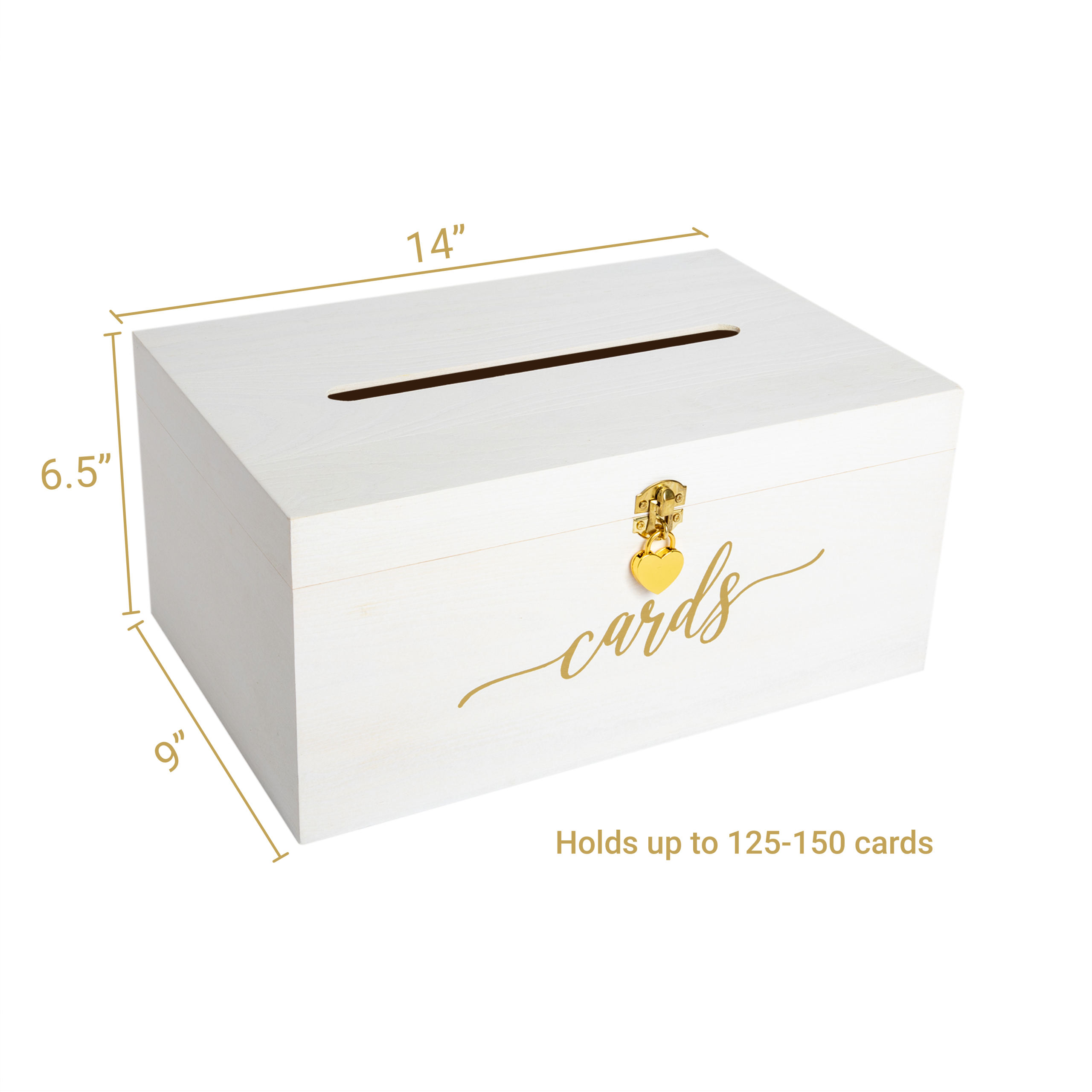
Wedding Card Box – 14 x 9 x 6.5 – White with Gold Sign – Secure Cards Box with Lock – Card Box for Wedding – Card Boxes for Reception – Best Way To Keep Cards Safe
Bullet Points:
There are a few grammar ‘mistakes’ like leaving off the ‘s’ for plurals but the key phrases had the singular version, not the plural version of the word. My objective was to optimize my listing for search, not to be grammatically correct for the few people who read the bullet points in an Amazon product listing.
John recommended I use a company called Soona for images. They specialize in taking pictures of products in staged environments. Ideally I wanted pictures of the box taken outside in a garden wedding venue, but that was asking for a bit too much. I could probably have that photoshopped if I thought it was appropriate, but the photoshop work I’d seen some of my competitors render of similar scenes was lackluster.
Amazon allows people to upload nine images to product listing, but only allows the listing page to display seven images, six if a video is uploaded. Amazon’s guidelines require that the first image be of the product on a white background. A number of my competitors ignored this rule and seemed to have success doing so but it was one of those things that was a hard rule we figured Amazon would crack down on eventually. We decided that it was better to abide by their guidelines.
I knew that I would upload a video so we had five additional image slots to fill. My user interviews had unearthed two additional necessary images. One slot needed to be the same image of the box on a plain white background with the dimensions of the box clearly listed. The other image people were clamoring for was a copy of one of my competitors images with the box resting on the seat of a chair. This gave people an additional reference point of how large the box was. My competitor used their chair perfectly and I based a bit of my decision on which of the five locations to have the shoot based on the chairs Soona had available.
I was hoping the other three images would be action shots of the box from different angles. I had ordered both white and gold envelopes on Amazon for the model I hired to put into the box and for the envelopes to be artfully strewn in and around the sides of the box. I also wanted the lock and key to glisten prominently in at least one photo since the security of the box’s contents was so important to so many people.
Soona did these shoots all day, every day, so they clearly explained how they worked prior to the shoot. They provided a link for me to log into their portal and view the images they were taking in real time, giving feedback on modifications to the box, the items in the environment, and to the model’s interactions with the materials we had at hand.
The photographer asked to shoot with the model first, to prevent her from sitting there twiddling her thumbs until she was needed. I agreed and we shot a number of action shots of the model opening the box, putting a card in the box, and closing the box. We also repositioned a vase of roses around and took another slew of pictures. I requested the box shot on the seat of the chair, but it was felt and didn’t look nearly as nice as the chair my competitor used, so it took a bit of time for them to find a nice wooden chair that was reasonably comparable and contrasted well with the box. Then I had the photographer take pictures of the open box with the cards strewn around and inside. It took a bit of experimentation but the photographer had the idea to place the cards like a xylophone within the open box, which looked amazing. We got a few shots of the model taking the artfully placed cards out of the box, then moved onto the white background photos. We shot the box from all angles, with the model opening the lock on a white background, opening the box itself, and taking the cards out of the box again, finishing with a couple of close up shots of the box itself.
It went by in a whirlwind of an hour, though the time the photographer and her helpers spent moving and rearranging materials allowed me periodic breaks, with time to assess the images I liked and the changes I wanted to implement, while staying on schedule.
The photographer promised that the Soona editing team would have their work done within 24 hours, and that I’d have the ability to pick and have them revise any aspects of the images. It went without a hitch and I had to stop myself from getting more than seven pictures, since so many of them came out so well. Here are a few:
![]()
Since this was the first physical product I launched I didn’t want to leave any stone unturned that could prohibit me from having a successful launch, so although it added to the upfront cost I opted to hire people to make videos. John recommended the company, JoinBrands, a freelancer video making aggregator website, where I could post a project and have people send me a pitch.
My customers weren’t going to have to assemble anything and my interviews showed that people scrolled down to view the pictures within customer reviews to see what products really look like, so I wanted the content creators to show the box in as close to a wedding environment as they could get. Two creators stood out to me right away, Brooke, who had some very funny videos of other products, and Zoe, who messaged that she had the perfect occasion to show off the box. I went with both, hiring them and giving them the opportunity to compete.
Zoe won. She was hosting her friend’s bridal shower in a couple of weeks and offered to use and show off the functionality at the event. She layered in storytelling and made my creation about as interesting as someone can make a wedding card box. Take a look:
Even with the honeymoon period Amazon gives new products with no reviews, having an aggressive initial ad strategy is necessary for a successful product launch. I’ve dabbled with Google Ads but John led me through a multi-hour tutorial on setting up a litany of Amazon Ad campaigns. He was clear that although the initial setup takes a lot of time, the ongoing maintenance of keyword bidding vs profitability and identifying new keywords to target should only take a few minutes if I do it a couple times a week.
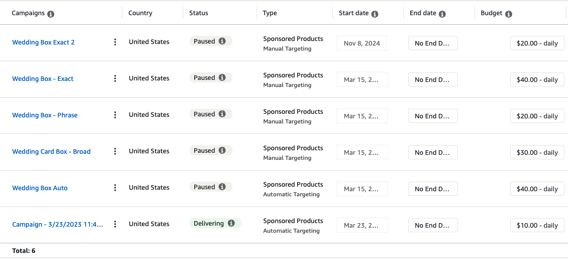
I’ll spare the technical details about setting up Amazon Ad campaigns here since it’s not relevant, but John recommended having five different types of ad campaigns running at once: exact keyword match, phrase, broad, auto, and a penny campaign.
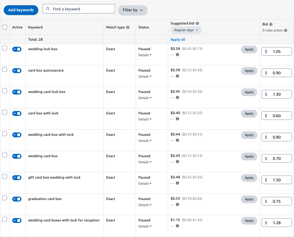
The exact campaign targets the exact keywords and key phrases people type. We populated these with some obvious keywords and key-phrases that we identified in our keyword research such as ‘wedding lock box,’ ‘card box with lock,’ and ‘wedding card box.’ Since these are long-tail keywords directly relevant to the product our goal was to keep our bids for the specific keywords low while having a high conversion rate.
The phrase campaign is similar to the exact campaign except the ad appears when a customer’s search term includes the exact keyword phrase in the same order, along with other words before or after it. An example is if I bid for the key phrase ‘wedding card box’ I’m really bidding for ‘______ wedding card box _____’ or ‘white wedding card box with lock.’
Amazon’s broad campaign is different in that it allows ads to appear for a wide range of search queries, including variations, synonyms, and related terms, even if the someone doesn’t use the exact keywords.
The Auto campaign gives Amazon full control in the keywords the system thinks it should target. All I control is the default bid amount I’m willing to spend along with the daily budget limit I want to set. The penny campaign is an Auto campaign that applies to all of the products I sell with a two cent default bid.
John explained that my average cost of goods sold (ACOS) which is the amount I spend on a bid vs getting a sale would likely be lower (a good thing) in descending order with the highest degree I’m able to target my most relevant keywords. This mattered more when I wanted to start honing down my ACOS and start making a profit. Initially, John and I agreed that our goal was to get people purchasing the boxes, start aggregating reviews, and identify my most important keywords.
Although the broad and Auto campaigns would generate some sales, one of our primary goals was to identify what exact keywords were hits and add those keywords into the cheaper exact keywords campaign to see if we can replicate that success. Delving into the search terms people used and moving them to the exact campaign would be part of my ongoing maintenance.
The biggest part of my ad maintenance was to examine the ACOS of each of my keywords and key phrases, adjusting my bid a couple of times per week based on the changes in ACOS. John’s ideal was to keep my ACOS between 20% and 30%. If my ACOS was too low, I was missing out on potential sales with too low of a bid. If it was too high, I ran the risk of blowing my budget on a few keywords that weren’t performing well. This didn’t matter initially, since I was hoping to drive views, clicks and purchases to my listing, still there were limits on how much I wanted to spend.
John recommended setting a budget limit of $20 per day, per campaign, excluding the penny campaign which put my maximum total expenditure at $120 per day. This was much more than I wanted to spend, but it was easily adjustable as long as I checked on it regularly, so I left it.
The other major time consuming task was to set my initial bids for keywords and key-phrases. Amazon gave the option to do this automatically, but John never recommended giving the company that level of control. Amazon wanted to drive orders, but they wanted the ad money and the system couldn’t give a hoot about the ACOS, so it was up to me to do it manually.
The final piece to having a successful product launch was enabling Vine reviews. If you’re not familiar, Vine is Amazon’s pay-for-review service. For $200 Amazon gives sellers the ability to give away up to 30 products in exchange for a review. If all 30 people review, and there’s no guarantee they will review the product, this boils down to $6.67 per review plus the cost of manufacturing, shipping, and handling of the product. It’s a steal and it’s the best way to get a head start selling a product.
I lucked out with Vine and got 26 5-star reviews, 2 4-star reviews, and 2 people who did not review. Many of the reviewers took pictures and videos of my product, one displayed the size next to Clorox wipes, one put a banana in the box to show the size, and one person made a video demonstration of the box.
The reviews started pouring in a couple of weeks after I launched the box. Unsurprisingly, I noticed a large increase in ad sales once I started getting stars next to my listing.
I knew making my first sale would send my heart a flutter, and it did, but both John and I were unprepared for the large volume of boxes I’d sell in such a short period. I had 120 units ordered in the first month for $3,588 in sales. Many of those orders were on a listing without any reviews. Those numbers jumped to 221 units ordered in the second month for $7,609 in sales. If you’re into Math, you may notice that my units ordered nearly doubled and that my dollars generated in sales more than doubled. The simple explanation is that I raised my price.
John and I agreed to set the initial prices at $29.99 per box with the goal of gradually raising the price to $36.99 per box. The boxes cost about $11.50 to manufacture and about $3 to ship. Accounting for Amazon’s enormous fees, I was doing a bit better than breaking even at $29.99, not accounting for my enormous initial ad expenditure. At $36.99 per box we projected that I would be in the 30% to 40% margin range, which was exactly at our goal. By the end of the second month I raised the price to $39.99 and was in trouble.
Just after the onset of our first call John told me that the biggest reason products fail is that people miscalculate their sales volume and run out of inventory. If there’s no inventory you can’t rank on Amazon. It’s very difficult to gain an organic rank back once it drops, but it’s also very difficult to anticipate the amount of inventory you’ll need for a new product launch.
It’s a balancing act. John explained in that first interview that to launch and maintain a product I’d need three batches of boxes in different stages of the sales process at any given time. The first batch of boxes would be at Amazon’s warehouses getting ordered by customers. The second batch would be in a cargo ship in transit to a dock. The third batch of boxes would be manufactured by my supplier.
Each of these areas have specific time-frames associated with the process. Amazon doesn’t want products to linger in their warehouses so they implement a fee structure. From 0-60 days product can be in warehouses at a relatively low cost. That cost increases the longer the inventory is left in Amazon’s warehouses. It takes me around 30-35 days to ship freight from my supplier to the boxes getting checked in at the warehouse. It takes another 35 days for my supplier to manufacture the boxes.
My initial order from my supplier was 500 boxes. We timed my release to coincide with the beginning of wedding season in March so all else being equal I expected my orders to increase until June or July. Within 1 week of my first customer order, I knew that I had to place another order with my supplier immediately if I had any chance of not running out of inventory.
I continued to raise my prices over the first three months of product launch and started scaling back on my ad spending. This equated to a decrease to 177 units ordered but a slight increase to $7,689 in cash drawn in. If you do the math, that’s 518 boxes sold in the first 3 months for $18,886 i.e. too many boxes.
I ended up having single digit stock left as my second order of 500 boxes were being checked into Amazon. How? Returns.
The returns started coming in a few weeks after people started ordering the boxes, around the same time I had to make my decision to order the next batch. John made it clear that my rate of return, between 10% and 20%, was unsustainable. He was hoping for under 5% returns. Presumably, most people who return products imagine that Amazon pays for the return fee, the item is possibly fixed, it goes back into the inventory, and it’s sold to someone else. This is not the case. The seller absorbs a large portion of the cost of the return. Obviously the cost of the item is refunded to the buyer, but Amazon keeps a significant portion of the ‘cost of the sale,’ so even if there’s nothing wrong with the item the seller is lucky to break even if they sell the item to someone else.
Amazon does a fair job tracking and logging the reason for the returns, though the data is usually less than a three word response and it’s a 50/50 chance whether people give a reason. Initially, the top three stated reasons for returns were:
Somewhat ironically, the top two stated reasons for returning the box were neck-and-neck. Prior to launching the box, I was aware that it would be difficult to estimate its size prior to seeing it. It’s the major reason the picture with the box on the chair was so important. Still, the lack of consistency in the size of the box was alarming.
The more concerning trend was the unstated return reason. Each return is associated with a specific order number. Since I sold the box FBA, I wasn’t able to see much information about the person returning the box, but I could see the date they ordered the box. I noticed a trend. Amazon’s stated return window is 30 days from the delivery of most items. The majority of returns occurred within one week of the end of the return window. My mind went to what one participant said as I was interviewing her, “Honestly, I would buy the box, use it for my wedding, then return it.” I suspected that she wasn’t the only one. I can make a bigger box. I can make a smaller box. I can even provide extra padding for the boxes. I cannot change Amazon’s return policy to prevent people from ‘renting’ the boxes, then returning them when they were done with it.
Despite losing money on each return, the one benefit was that Amazon theoretically checked each box on its return and if it was still in good condition, they would add it back to my inventory and I could sell it. Still, I wanted to tackle as much of the return issue as I could before placing another order of boxes with my supplier.
First, I tackled the low hanging fruit, negotiating with my supplier to pack the boxes in better bubble wrap, thicker cardboard boxes, and add a moisture wicking bag to help the wood from cracking. I also asked them to double check if the locks were inside the boxes, since I had a couple of returns claiming there was no lock within the box. Once we agreed on those details, I placed the deposit for my second order of boxes.
The size issue was a bit more complicated. If I had a larger box manufactured, I’d jump into Amazon’s extra large storage tier, which was prohibitively expensive. Despite the large size of the box being my biggest return rate, many of the reviews on Amazon mentioned the large size of the box as a positive. It was easier and more cost effective to focus on manufacturing a smaller box first. It was also possible that having a larger and a smaller option would provide psychological relief to customers who wanted the bigger box that they purchased the larger of the two options. I negotiated the price with my supplier and put a deposit down for 500 more boxes a few weeks after I placed the order for the larger boxes.
John and I hoped that this combination would reduce the return rate to a reasonable level. Sadly, there wasn’t much I could do about people renting the boxes, then returning them right before the return window closed. I understood why they did it, since the box had a pretty singular use case and would sit in storage or they’d throw it out after they used it for their wedding, but I figured it would be as the lone man I interviewed said, “I don’t care if the box is $20 or $30 dollars. Compared to how much I’m spending for the wedding I care if a box is $10 vs. $50 or $100.” Even if people had no use for the box after their wedding, I didn’t think the hassle of returning the box was worth it to most people. I was wrong.
Between my expenditure on ads and my high return rate, I was barely breaking even. John was reluctant to reduce my ad expenditure too much, since the boxes were selling so well, but he agreed that my ACOS was high and that I was at risk of running out of inventory, so we focused on lowering my bids for ads, until my ACOS fell between 20% and 30%.
By the time I started selling my second shipment of boxes I successfully lowered my ACOS to 25% but my return rate was still high averaging between 15% and 20%. I hoped John would come up with some brilliant idea to reduce the return rate, but his only recommendation that I hadn’t tried was including a pamphlet urging people to contact me directly for a replacement or a return instead of sending the box back to Amazon. I was skeptical, since Amazon made returns so easy, but I agreed to give it a shot.
Amazon also lost 100+ boxes while they checked in the second shipment. They denied responsibility, of course, attempting to place the blame on my supplier for shipping the incorrect number of boxes, and it became a weeks-long battle contacting Amazon Seller Support in an attempt to get the boxes found or reimbursed.
My supplier also put the same UPC codes on the smaller and bigger boxes, preventing Amazon from checking them in properly on arrival, which resulted in more confusion on all sides. Amazon started mixing and matching the orders of small boxes and large boxes, my supplier denied wrongdoing and my return rate skyrocketed.
Still people kept on purchasing boxes.
As I noted above, when people returned the boxes Amazon checked their condition. If the boxes were in good condition, they were put back into my inventory on Amazon. If there were defects I had them shipped back to me. Some of the boxes had cracks on the top, but most of the boxes were just worn with fingerprint marks, missing locks and keys, and in fixable condition. Initially, I fixed these boxes up and sent them back into Amazon, but as the returns kept piling up I kept searching for a way to mitigate Amazon’s liberal return policy.
Enter Etsy, the craft and ‘homemade’ shopping platform. I’d considered selling on Etsy once I had established selling on Amazon, but John had dissuaded me, encouraging me to focus on mastering one platform before moving to another. I listened initially, but when I delved into Etsy’s customizable return policy, I set up an account and started selling.
Ramp up was slow, since I didn’t have any reviews, and I was still selling on Amazon, but once the first review came in, orders started ramping up. My sales numbers weren’t close to the numbers I was doing on Amazon’s of course, but as I began selling more boxes I noticed a few trends:
The final straw was when Amazon deactivated my listing due to a high return rate. Once a listing is deactivated it costs up to 5x more to ship products from Amazon’s warehouses to my office, so I submitted an immediate appeal and spent hours on the phone with Amazon, jumping through each hoop to get my product relisted. It took a couple of weeks, but as soon as Amazon reactivated my listing, I created a removal order, shipping half of my inventory to my office. A week later I created another request to ship the rest of my inventory and have been selling boxes successfully on Etsy ever since.
Although I completed user interviews, a product viability analysis, and a keyword analysis, there wasn’t any data to show that wedding card boxes had a high return rate. About six months after I started selling the boxes on Amazon a ‘high return rate’ box appeared on a slew of Amazon pages, including mine and most of my direct competitors. If I had seen that six months earlier, I would have avoided the product and focused my efforts on a less returned product industry-wide.
My experience on Etsy shows me that the high return rate isn’t as much of a wedding card box issue as it is an Amazon and perhaps an issue of mindset. Amazon makes returns easy, but my friends who are French and live in Paris said something that stuck with me. They were aghast at my return problem stating that, “Nothing like that would ever happen here. If we, or any French person orders any item off of Amazon we would never return it, unless it was seriously damaged.” They were insinuating that it’s a cultural issue and at the time I bought their argument, but with the success I’ve had on Etsy, I believe it’s more a relationship issue.
When people purchase items off of Amazon, they think of Amazon and perhaps the brand they’re buying, but they don’t think about the person selling the item. Most Amazon customers don’t realize that unless they’re buying from a brand like Apple, Amazon itself, or an Amazon gated listing, they’re probably purchasing the item from a small business owner selling the product on Amazon’s platform. Amazon tries to hide the ‘seller’ as much as they can.
Etsy operates on a different model, de-emphasizing any ‘brand’ and placing the focus on the human crafting the item the customer purchases. I include a handwritten note for every box I sell on Etsy, thanking people for their order, and encouraging them to contact me if they have any issues. It’s the same product but in my customer’s mind they’re purchasing the product from a person rather than from a business and that makes all the difference.