I met Michael Whitt via an introduction through a mutual acquaintance, Madison Wagner, while I was at Designlab’s bootcamp. He expressed a desire to update the look of the app he developed to share cattle market data across the United States, Cattle Market Mobile (CMM). I heard him and on our initial call I told him I could update the UI to a modern look, but I expressed a desire to delve deeper and figure out if his app was satisfying his user’s needs.
He asked what that meant and I suggested an initial data gathering survey that should take no more than two minutes. If people were open to it I’d gather some emails at the end of people who were interested in chatting about their experience using Cattle Market Mobile. Michael seemed excited at the prospect of hearing from real users and agreed quickly after I mentioned that we could keep costs down especially since we sourced our own users.
I always get emails at the end of surveys to gauge interest in the responders willingness to participate in user interviews. Sometimes, it’s the primary reason I give the survey, but I had some important questions for the participants:
*Prior to launching the survey, Michael mentioned that the most frequent question he gets from users is why Cattle Market Mobile doesn’t show their state or a specific market report within their state. Cattle Markets within the United States essentially fall in one of two buckets, those that use the USDA’s Agricultural Marketing Service and those that do not use the USDA’s service. Initially, CMM only drew data from markets that used the Agricultural Marketing Service, so a number of markets that were important to people across the country were excluded.
I got 44 responses, with a predictably low but still significant, 13 emails, amount of people interested in talking more about their experience with CMM. I sent out follow up emails to the interested parties while I combed through the data.
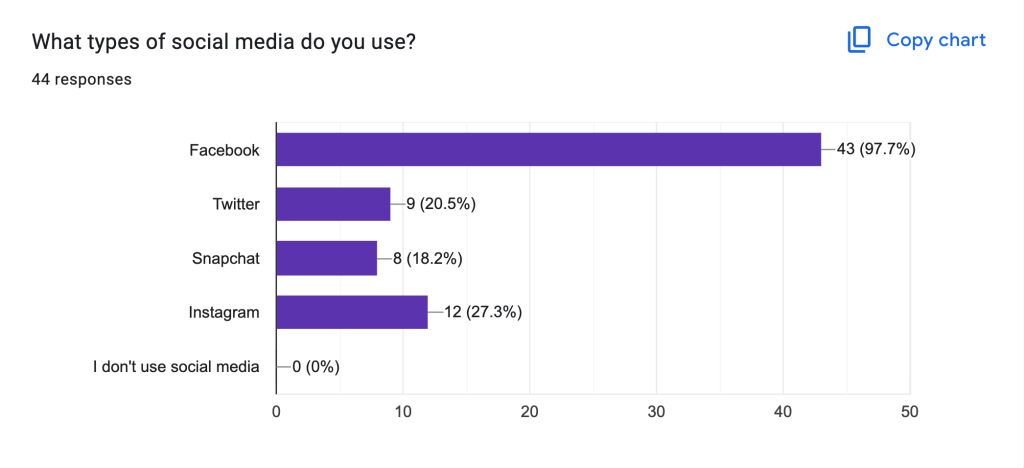
Although I didn’t get any traditional demographic data such as age, the social media use data corroborated my suspicion that most of the responses were from ranchers who were Gen X and Millennials.
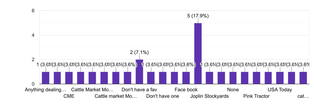
The pieces of software that gained multiple responses were the American Angus Association, Angus Mobile, Beef Market Central, and iHerd. The only website that got multiple responses that people visit regularly was Drovers.com. I got a number of other responses but they were generally localized to the state or county the person bought or sold in.
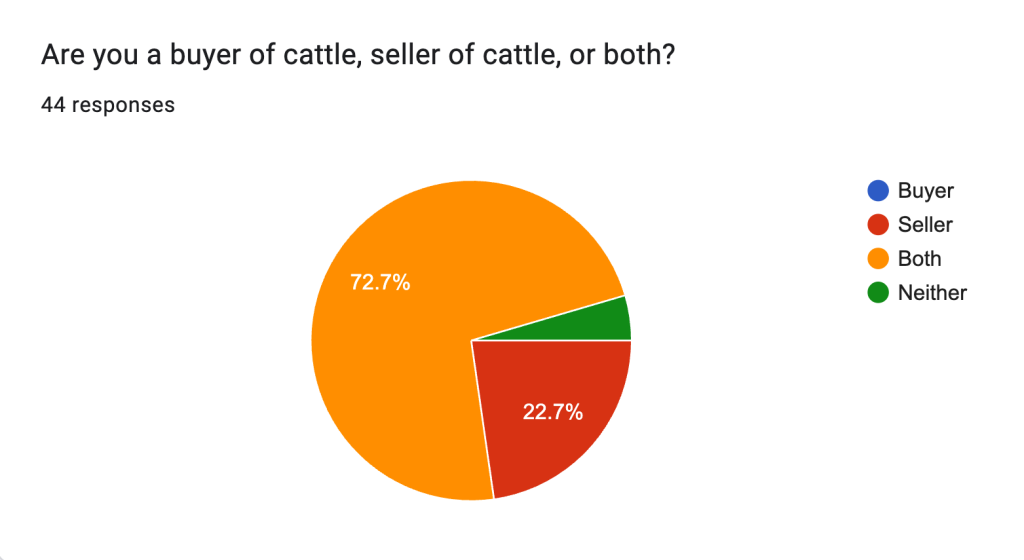
Most people who responded bought and sold cattle. There were a large portion of people who were just sellers, but interestingly there were no buyer responses.
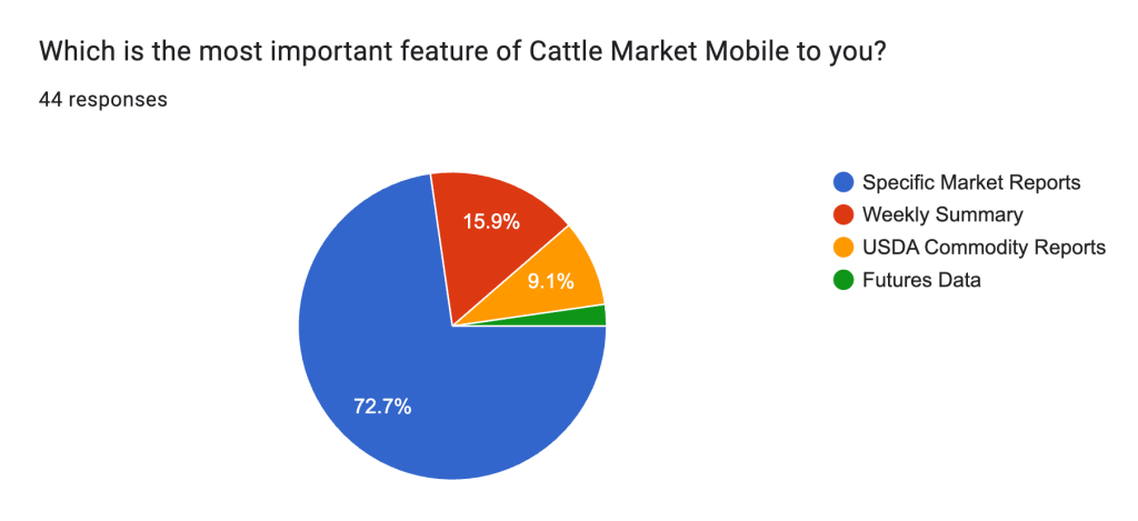
At first glance, user’s favorite features followed a predictable response rate with people’s favorite market reports representing the largest portion of the responses, followed by a summary of their chosen market’s weekly activity summary. Cattle are considered a commodity so it tracks that some ranchers would be interested in other commodities. Futures data also snuck into the data with a single response.
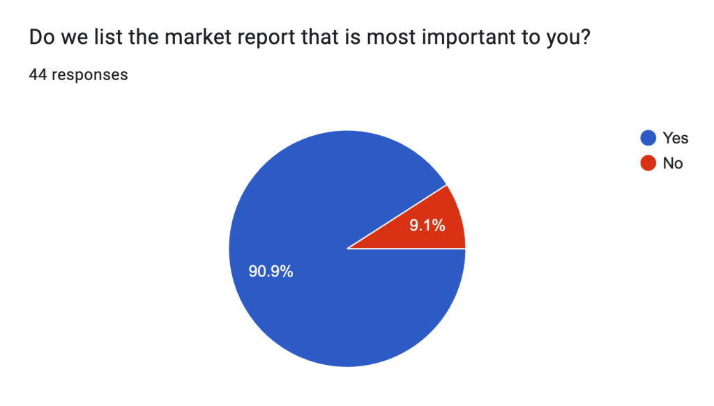
Since we posted a link to the pole directly on the Cattle Market Mobile homepage, it’s unsurprising that most current users were able to view the most important market to them directly on the app. Of the people who responded ‘No’ there was a mix of specific markets they were missing and areas of the state they were interested in that weren’t shown.
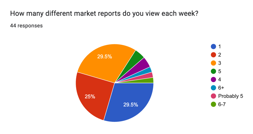
The clear drop off after three market reports made this one of the most instructive response rates of the survey. Michael and I already had ideas on making CMM easier to use. Gaining an idea of the number of market reports people were most interested in viewing was critical information in easing the process of helping people access that data.
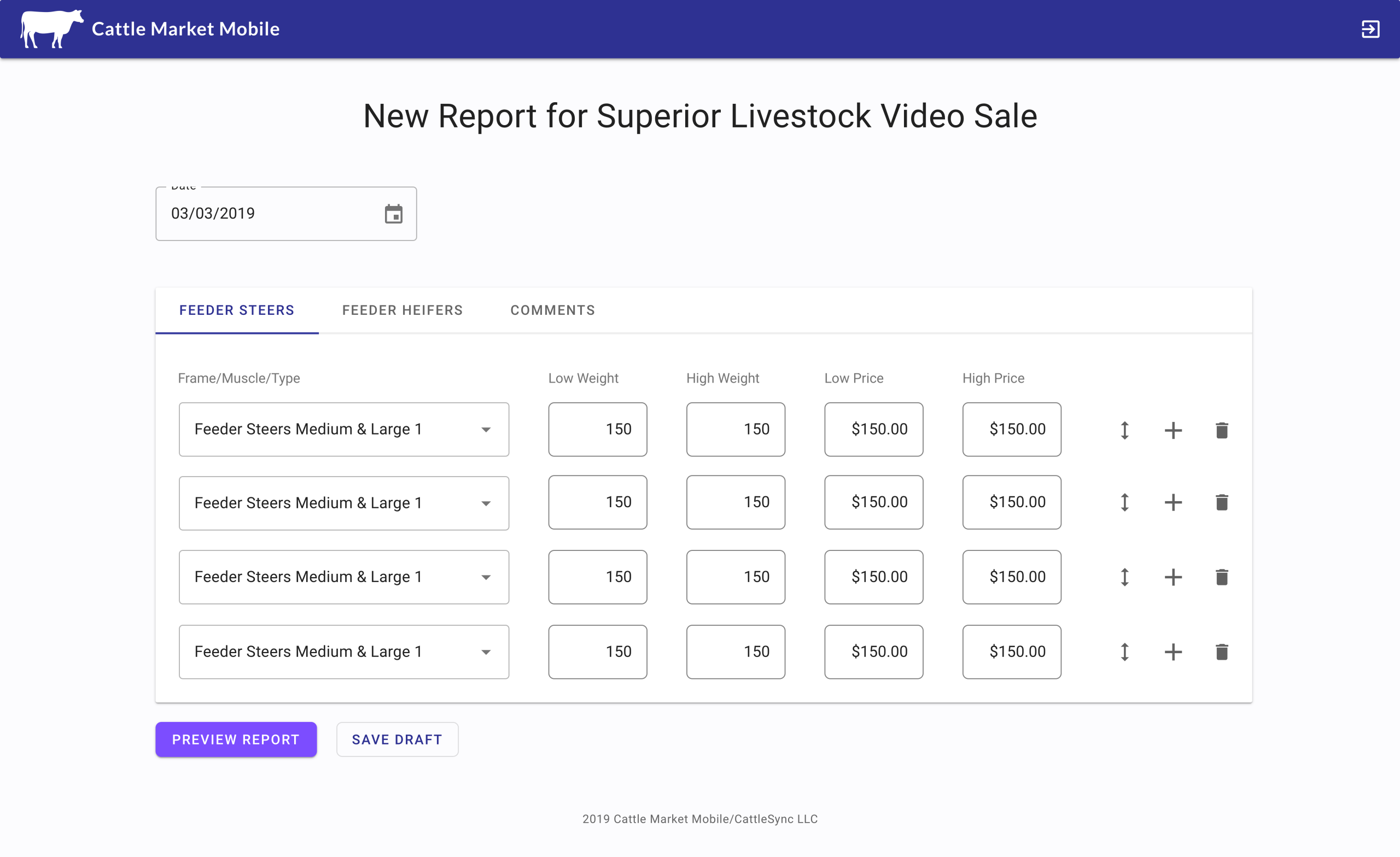
Michael built the navigation structure so each market report is under the ‘folder’ of each state. If users wanted to access the market report for a different state, they would have to navigate back to the ‘State screen’ and delve down into another state’s list of market reports.
My final question was asking in an open text response, what specific information people were looking for on CMM. There was a high degree of uniformity in responses with the most common response being some version of ‘feeder cattle prices.’ There are four stages of cattle rearing, cow-calf operation, feeder stage, feedlot, and slaughter. Most calves are bought and sold at the end of the cow-calf operation and at the start of the feeder stage.
Surveys are important and can provide valuable data but I love conducting user interviews because I can delve deeper into the ‘why’ of what people noted in the survey. A quick note about Google Surveys, the platform I conducted these on, is that they allow the owner to drill into the individual responses, so I was able to match the information of the people I interviewed with their survey responses.
Since John and I had a good idea, through the survey data and through app tracking data, that most users navigate to their market reports of choice before closing the app and the fact that we were dealing with an audience that lagged behind the technological curve I opted to make these initial interviews a conversation, rather than a usability testing session. This allowed me to build off the survey and delve into people’s current usage and desired improvements with the app.
We offered a gift card to Bass Pro Shop for each interview I conducted, although as with all of the user interviews I’ve conducted on people who currently use the product, the audience seemed less enthusiastic about the gift card and more hyped to talk about the product.
Before I got into my CMM specific questions I wanted to learn a bit about who I was interviewing. I interviewed five people, one of whom ran a stockyard and auction, two owned a farm as a hobby, one ran sales at a livestock center, and one fascinating woman who breeds cattle, sheep and goats. She tracks the genes of her cattle so thoroughly that she only allows them to breed with other cattle who have similar genetic data, primarily with specific cattle in Japan.
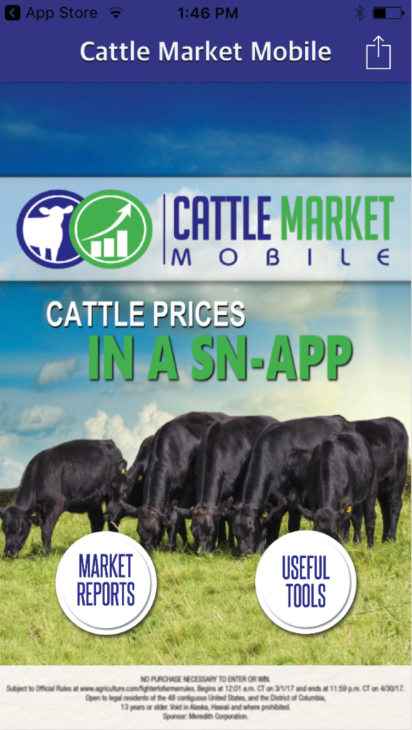
One critical piece of information became clear as soon as I started asking people about the other cattle related websites they used and the reason people accessed these sites. They were interested in futures data regarding cattle, but also the futures data of other commodities. Each of the five people I interviewed mentioned accessing and viewing futures data independent of each other and without a single question related to futures data on my interview guide. What makes this so interesting is that Cattle Market Mobile has pages of futures data, constantly updated, and displayed for a large amount of livestock and non-livestock related commodities. The issue was that the futures section of the app was stuck behind a button labeled ‘Useful Tools.’ The other button on the homepage was labeled ‘Market Reports,’ what the vast majority of people only view on Cattle Market Mobile.
Another major piece of information was that when I asked if there was anything he would change about the application, my second interview didn’t hesitate to mention that he wanted a way to save and access his favorite market reports. This was another feature that existed within the app, though it was more buried behind the useful tools button than the futures data.
Bringing a ‘Favorite Market Reports’ button to the homescreen had the potential to completely change how people navigated through the application and accessed market reports. It would significantly lower the number of screens people clicked through, easing a pain-point for the user. I wasn’t sure Michael would go for it though. He gained ad revenue from the States screen. Allowing people to bypass that navigation would take away that revenue generating page. Still, I put in a question at the end of the interviews whether people would be interested in saving their favorite market reports. Predictably, each of the next three people I spoke with were excited for the functionality and said they would use the ‘favorites’ immediately.
Michael had a few questions he suggested I ask, one of which was whether people subscribed to notifications, specifically of a new market report being posted. People were split with two deeming it essential functionality. The others didn’t want to be bothered. Two of the participants noted that they used the gestation calculator, which is also under useful tools, though they noted they accessed it on an as needed basis. One participant said that it was frustrating that the date and time the market report was last updated wasn’t immediately obvious, recommending that we make the information sticky at the top of the market report. There were also general recommendations and wants, such as showing market reports not published by the USDA, integrating some ‘professional opinions’ on cattle market data, and creating a grazing tracking portion to the application, but those ideas fell into an ideas for later bucket.
When I presented the data to Michael, I was pleased to learn that we were aligned in easing people’s access to futures data and bringing the ability to save market reports to the forefront. He was aghast that so much of the functionality people wanted was already built within the app, but that people couldn’t find it. I felt like it was lucky though, that most of people’s major gripes were low hanging fruit that were easily solvable issues. We agreed to let me modify the homepage, adding buttons for ‘Future’s Data’ and ‘Favorite Market Reports,’ while also adding ad space on the bottom of the homepage to help offset the revenue loss of people navigating through the State’s screen.
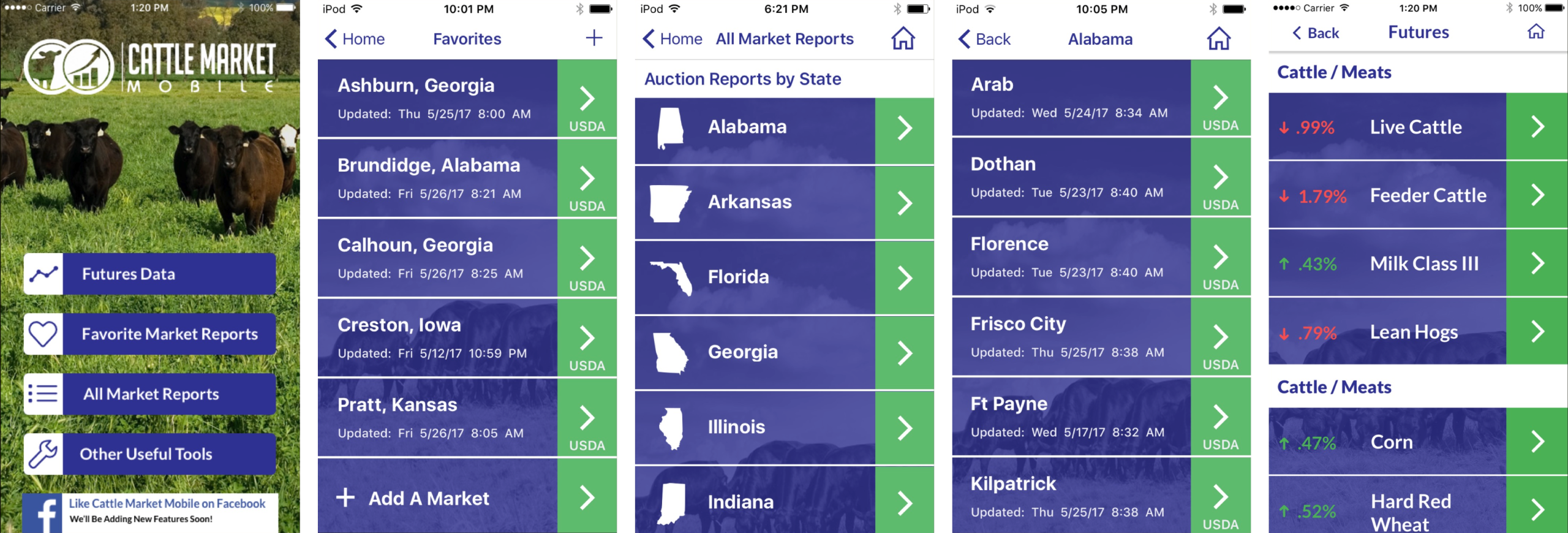
I updated the look and feel of the entire application, within the constraints of staying with the brand’s color scheme of purple and green. I also completed a couple of clean-up tasks such as adding calls-to-action where appropriate, adding the date and time the market report was last updated, and enhancing the readability of the list items. It was a major design overhaul and I was worried how users would respond, especially to the new look and feel of the application.
I didn’t need to worry. If people had issues with the UI, the ‘additions’ of favorites and the futures data eased their minds. The favorite market reports and futures page became the two most viewed pages aside from the homepage within a week of launch, enhancing the usability and the functionality of the application.